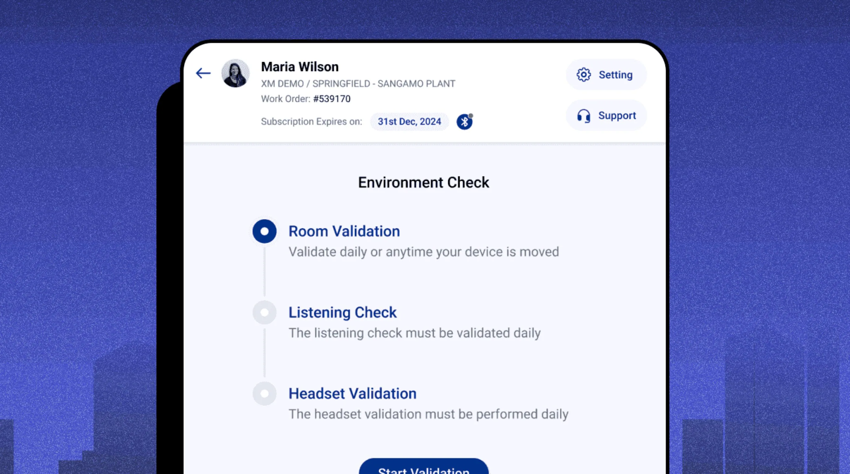
Starting a test meant jumping between screens, mid-session.
Tests, participants and calibration lived in different corners of the app. Six of eight technicians named start-up as their #1 friction.
On-site hearing tests with a workflow that has a spine.
A web and iPad app for CAOHC-certified technicians running hearing tests at client facilities — rebuilt around one guided workflow.
Faster session setup — from ~20 min to under 10
Recovered per technician per site day
Guided steps now cover ~90% of the test process
Tests, participants and calibration lived in different corners of the app. Six of eight technicians named start-up as their #1 friction.
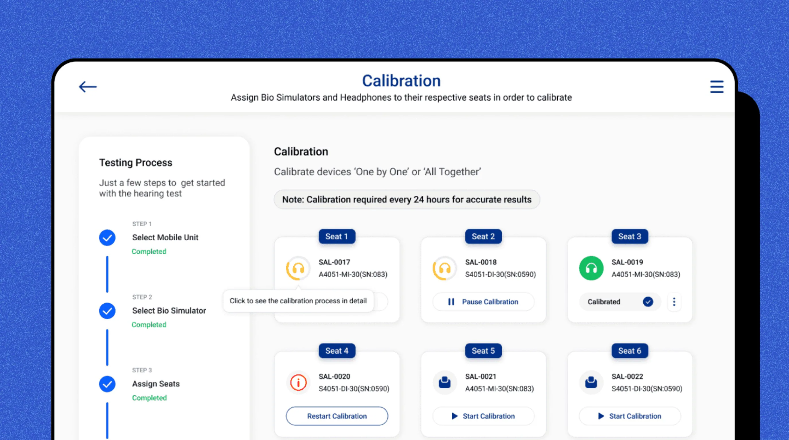
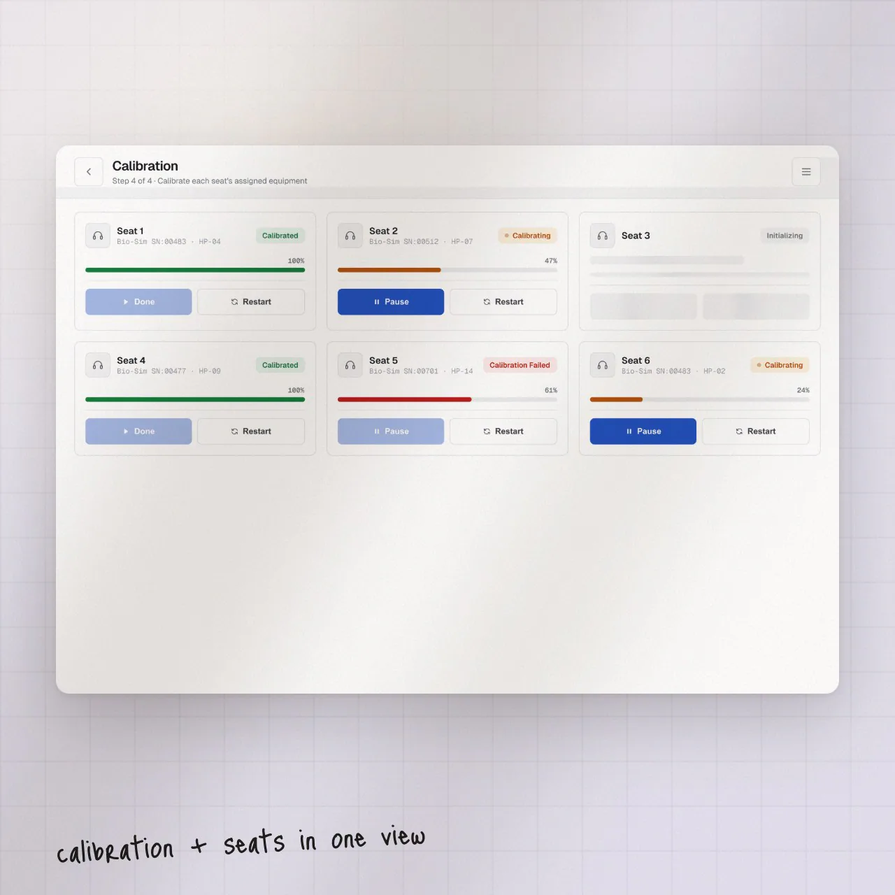
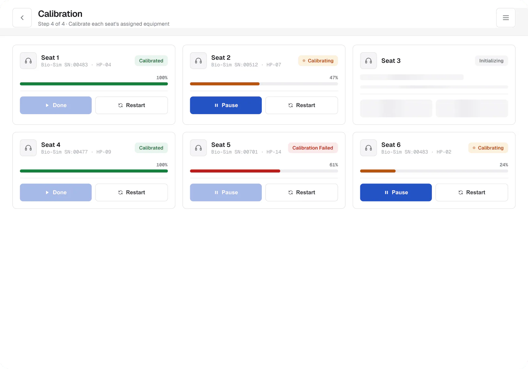
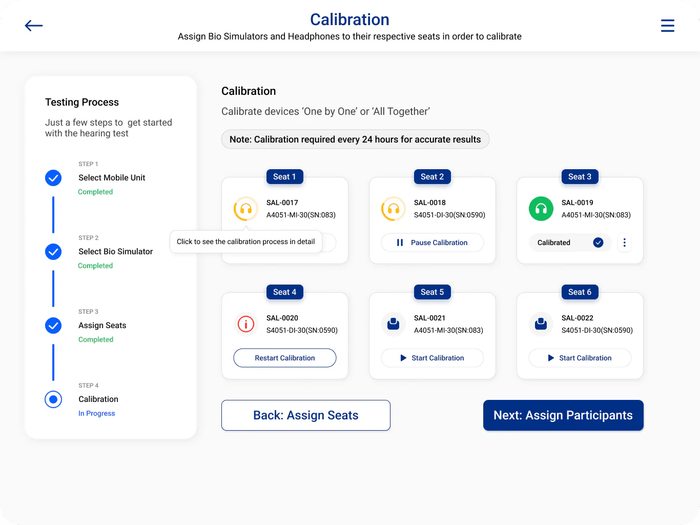
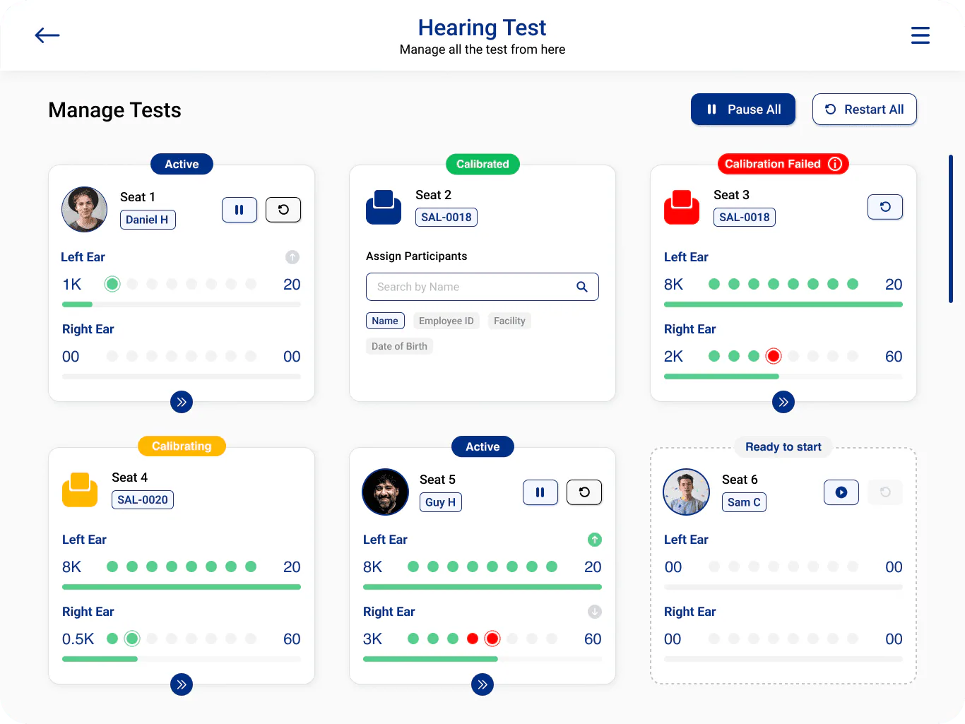
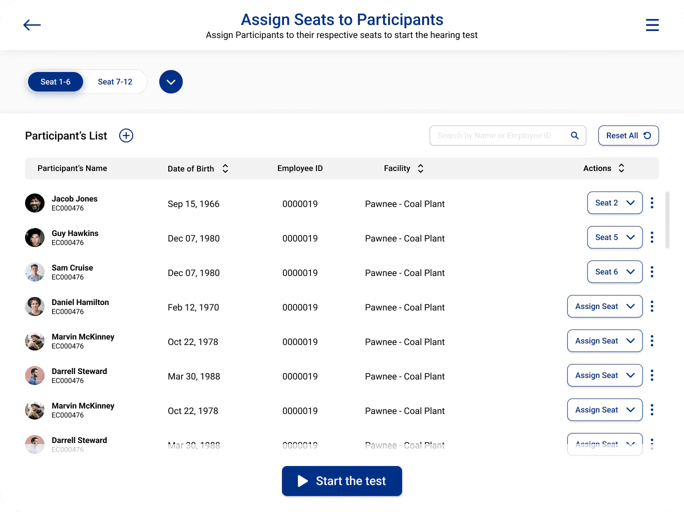
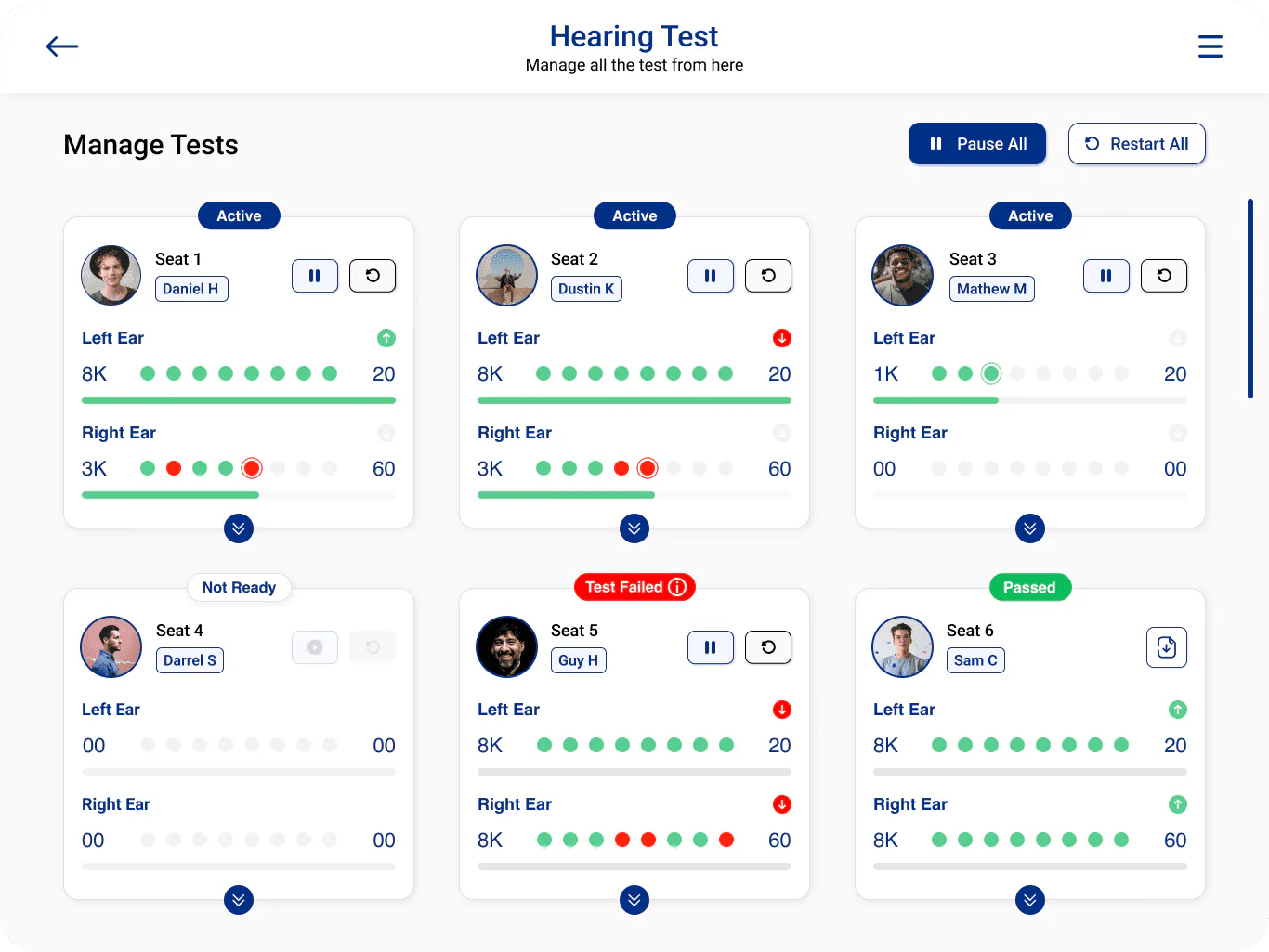
Four steps — mobile unit, bio simulator, seats, calibration — with live status for every seat on one screen.
New technicians started running sessions without a supervisor. Over an hour recovered per technician per site day.
A 12-week redesign. Live shadowing wasn’t allowed inside sessions, so I ran structured questionnaires through the technician team lead and let that signal anchor the work.
Structured questions via the technician team lead.
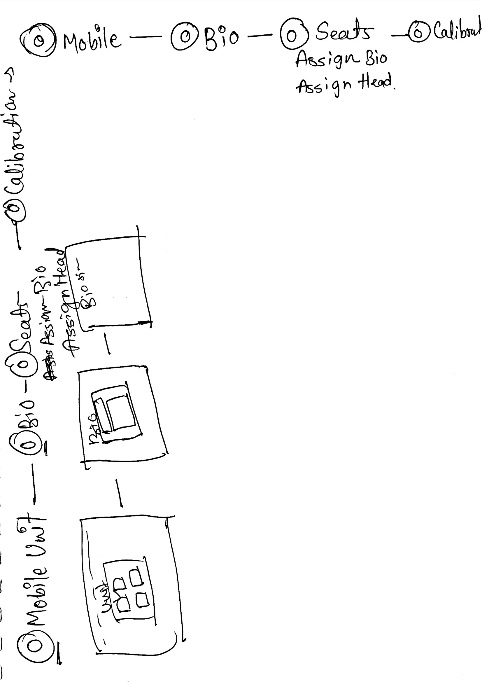
Three directions on paper before committing.
Four steps covering ~90% of the process.
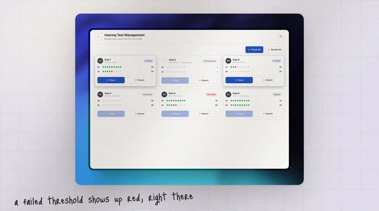
Per-seat status and dot-timelines.
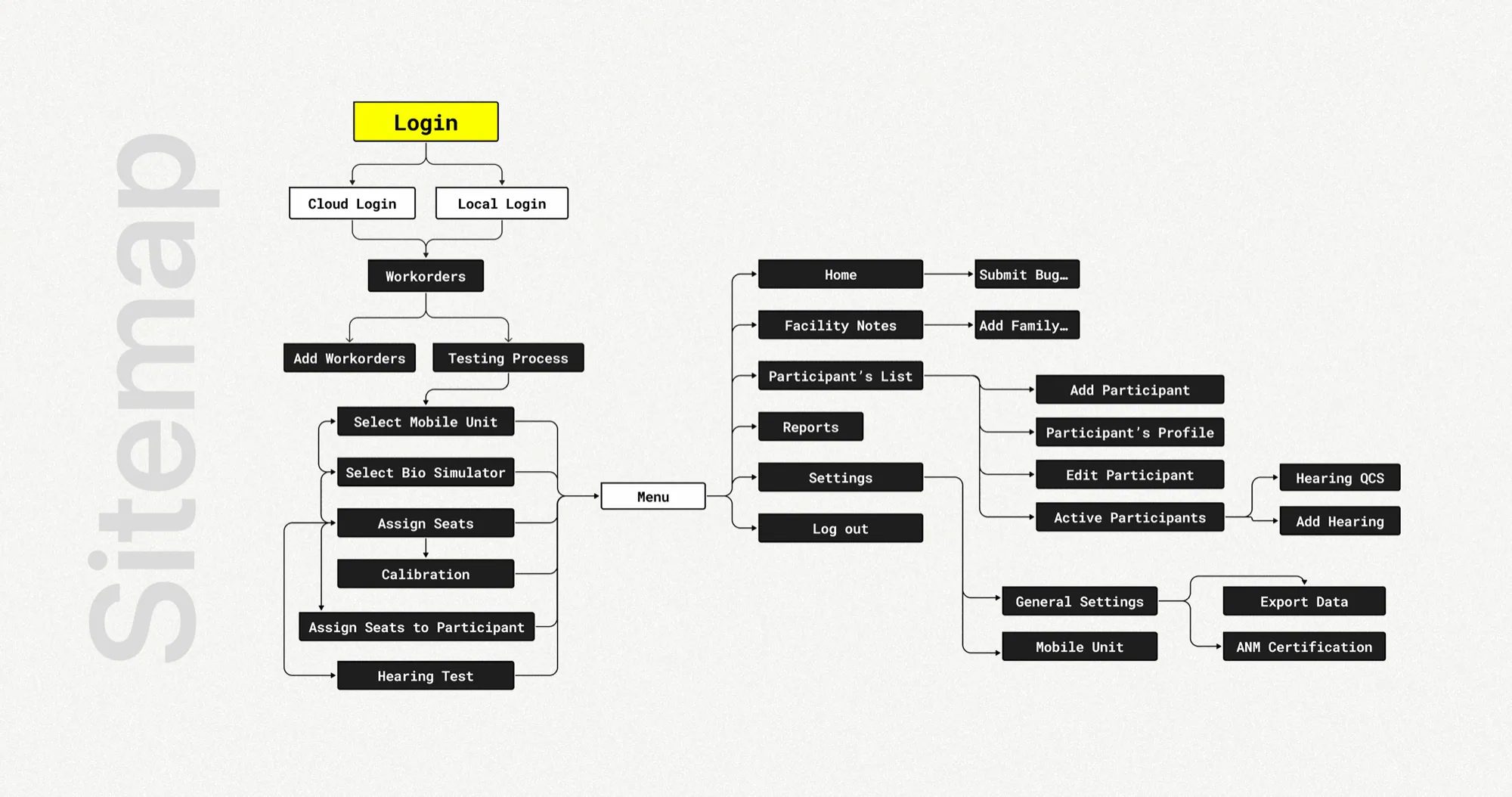
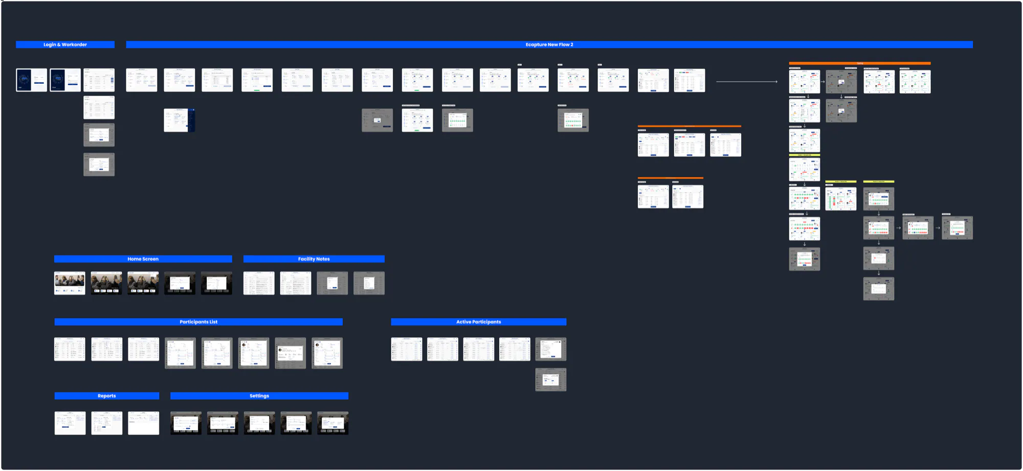
Sitemap and rebuilt flows, in order.
Technicians jumped between screens to start a test, track who was where and check calibration. Setup ran long, small mistakes compounded, and new technicians needed a supervisor.
Live shadowing wasn’t possible — on-site testing doesn’t allow observers inside sessions. I ran structured questionnaires through the technician team lead instead. Six of eight technicians reported the same friction.
Six of eight technicians called the initiation flow confusing — especially newer ones.
New technicians needed too many hours to become independent.
Managing participants live meant hopping between screens.
No progress or error states — technicians couldn’t tell if an action had worked.
The takeaway wasn’t “make the UI cleaner.” It was “give the workflow a spine.”
That shifted the redesign from UI polish to restructuring the whole experience around task flow and decision-making.
The combination reduces cognitive load and moves users through tasks in order.
In exchange: fewer user errors and a shorter session setup. In this context it was a clear trade.
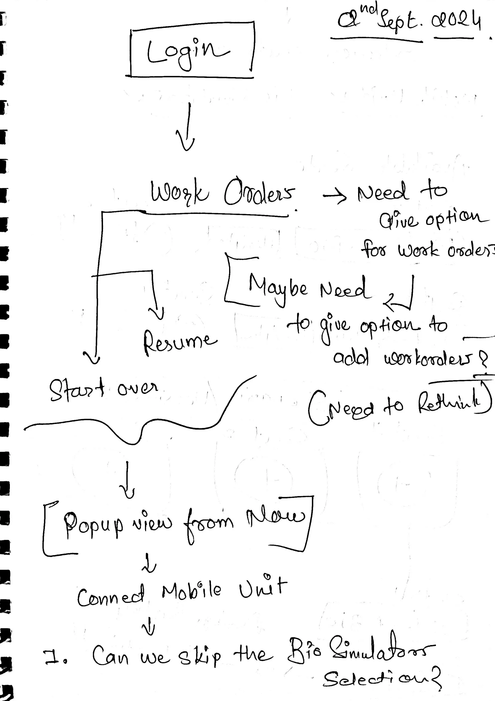
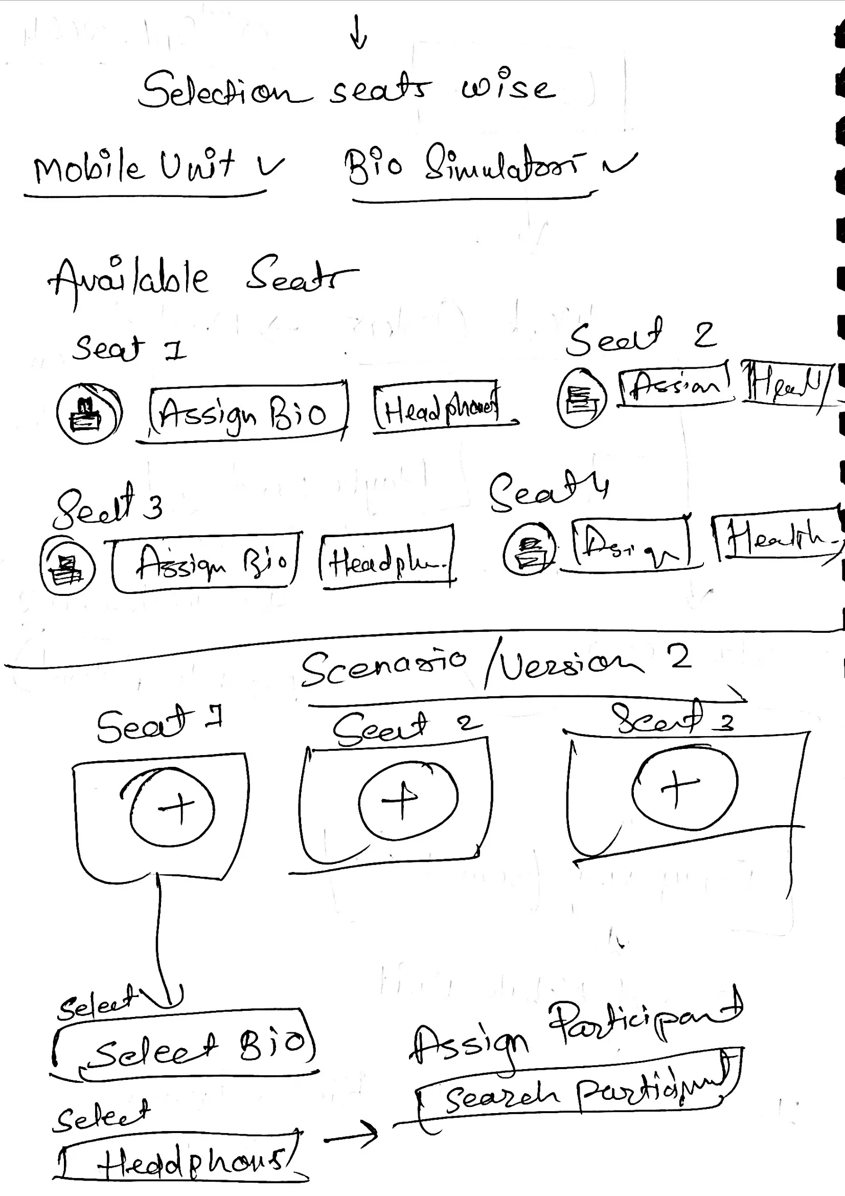
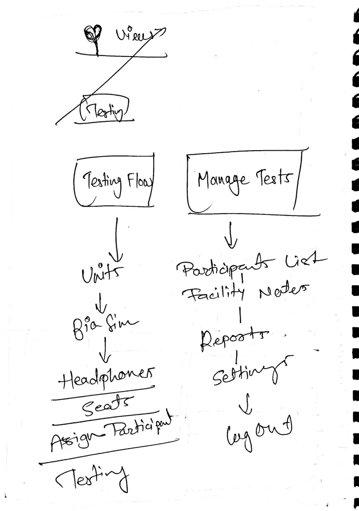
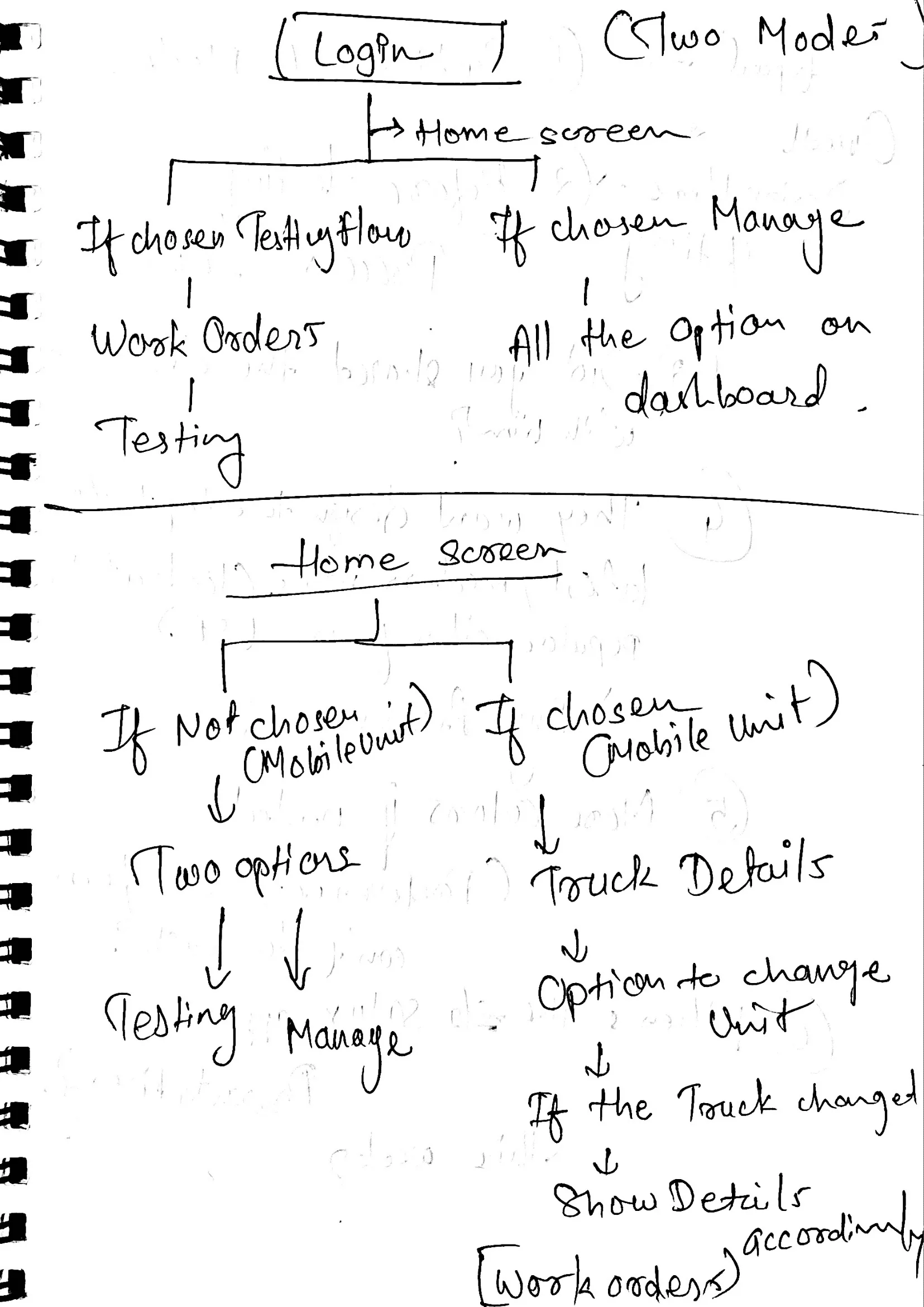
In the old flow, technicians context-switched mid-session while participants were already seated — and lost their place, or recalibrated what they’d already calibrated.
Calibration and seat assignment live together, with real-time seat status — nothing held in short-term memory.
Mobile unit → bio simulator → seats → calibration. A cognitive offload tool for someone managing eight people under time pressure.
Roughly 90% of the testing process now moves through four defined steps with clear instructions.
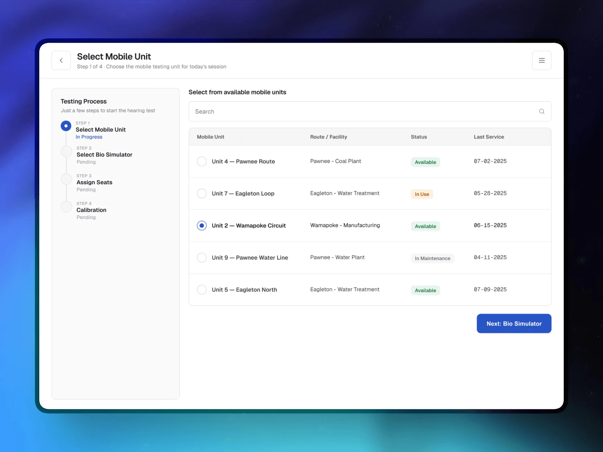
The flow starts with the vehicle, not the equipment — pick the wrong unit and everything downstream is wrong. Status (Available, In Use, In Maintenance) is visible before a technician can tap in.
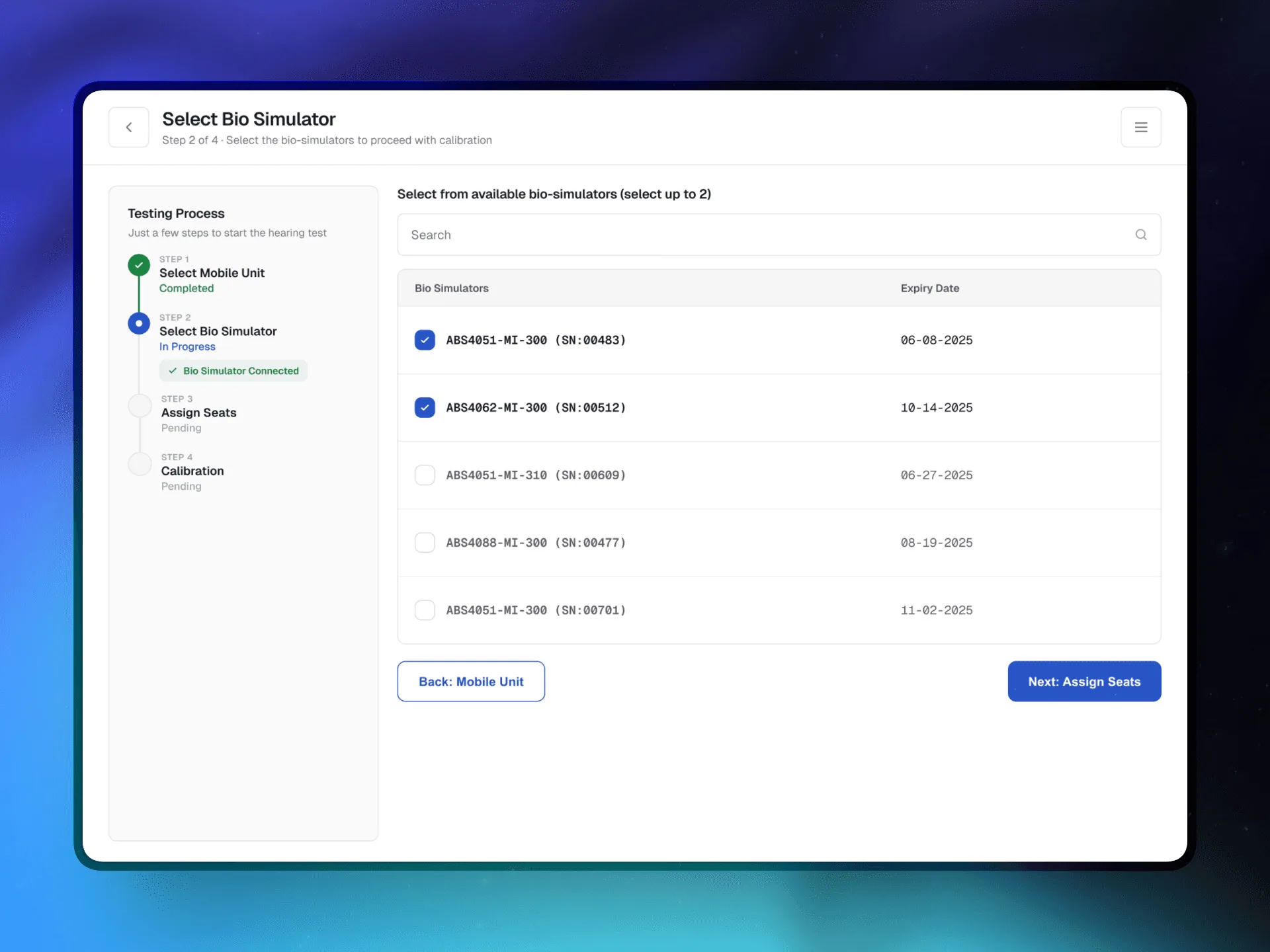
Bio simulators expire, and an expired one invalidates the whole test. Expired units are disabled, not hidden — technicians see why something can’t be picked. Up to two for redundancy.
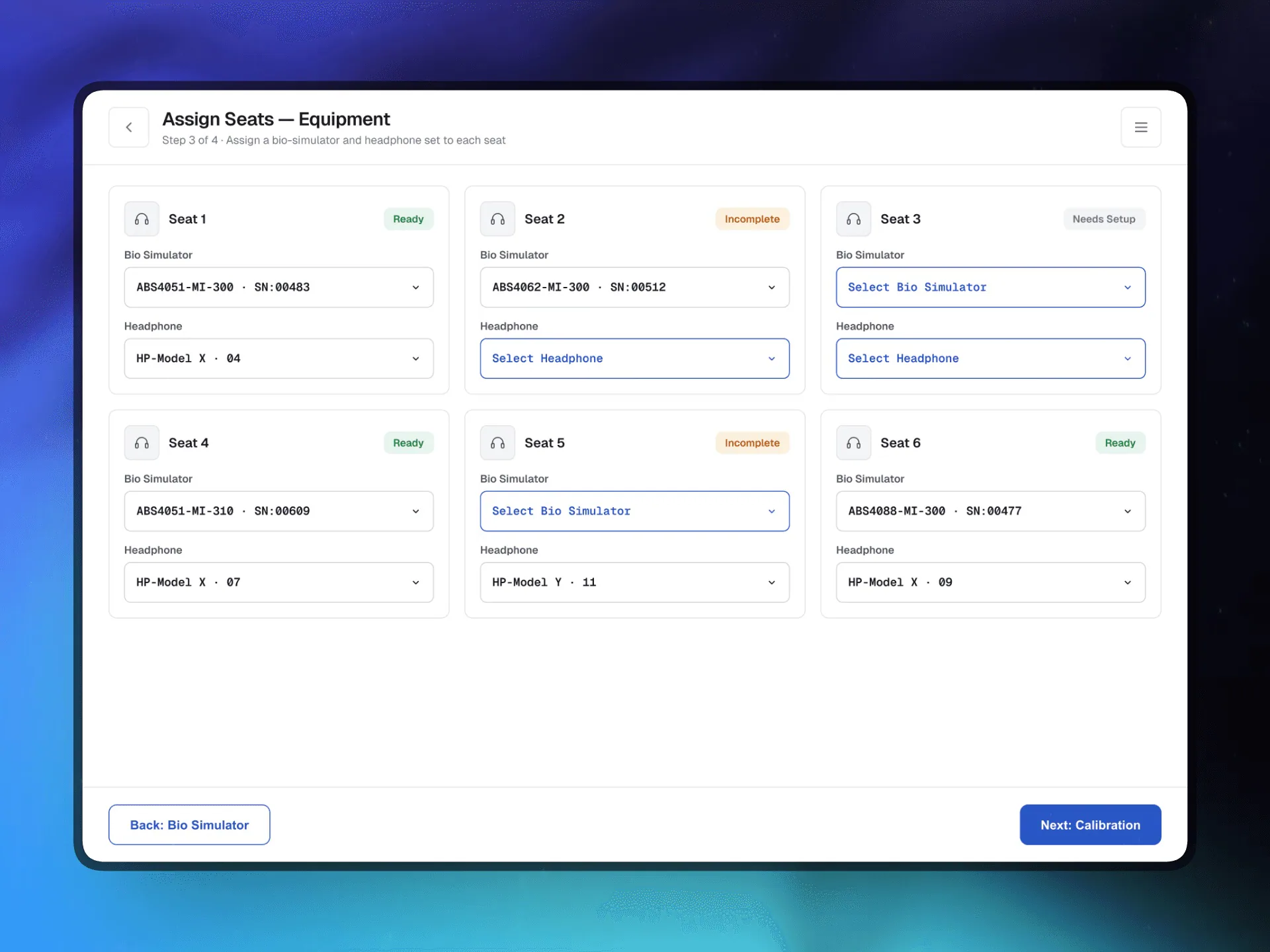
Hardware to hardware only — simulators and headphones to seats, no participants yet. In the old interface those two jobs blurred together.
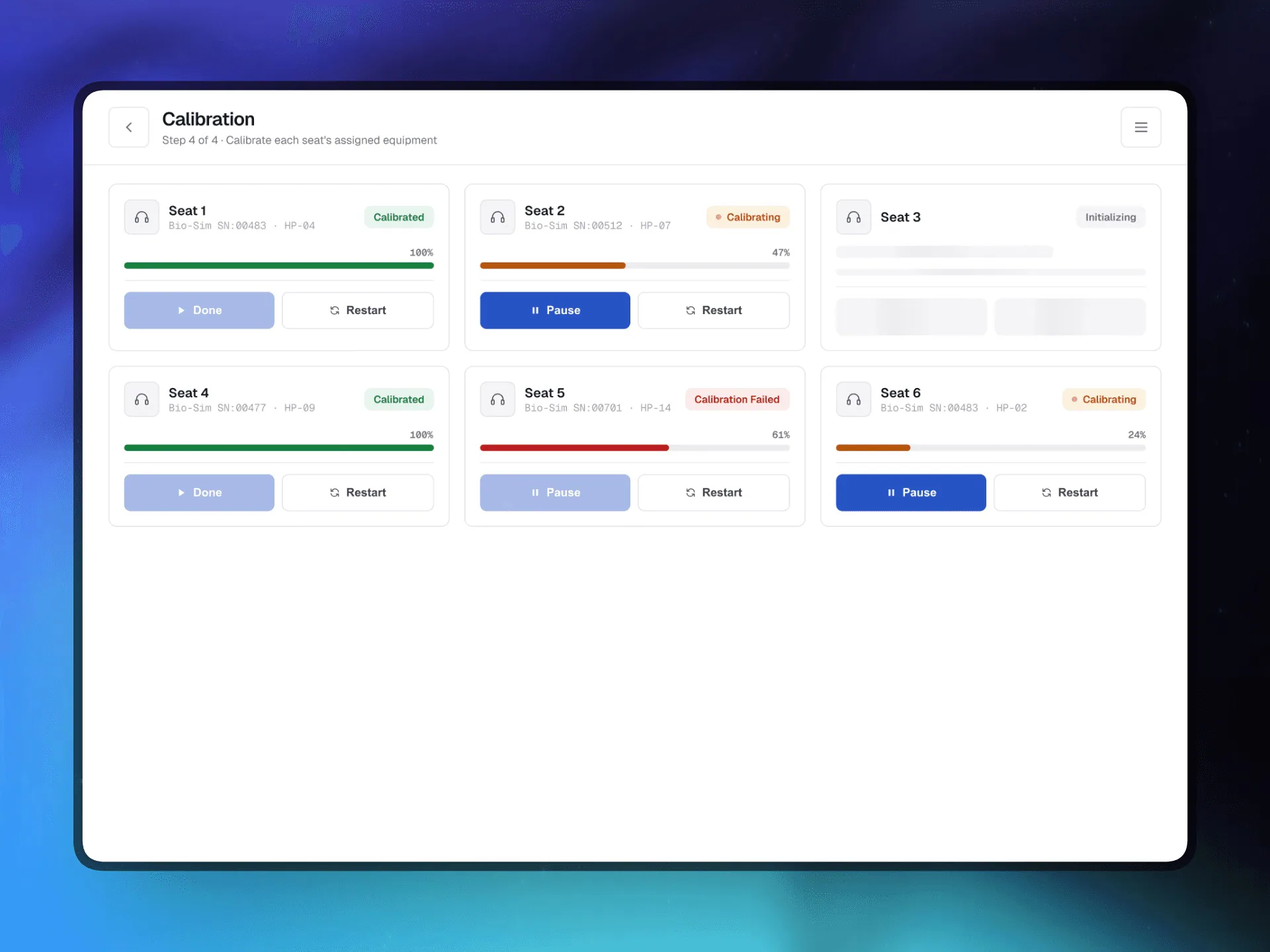
Seats calibrate one by one or all together, each with its own progress state. One failed seat never blocks the five working ones next to it.
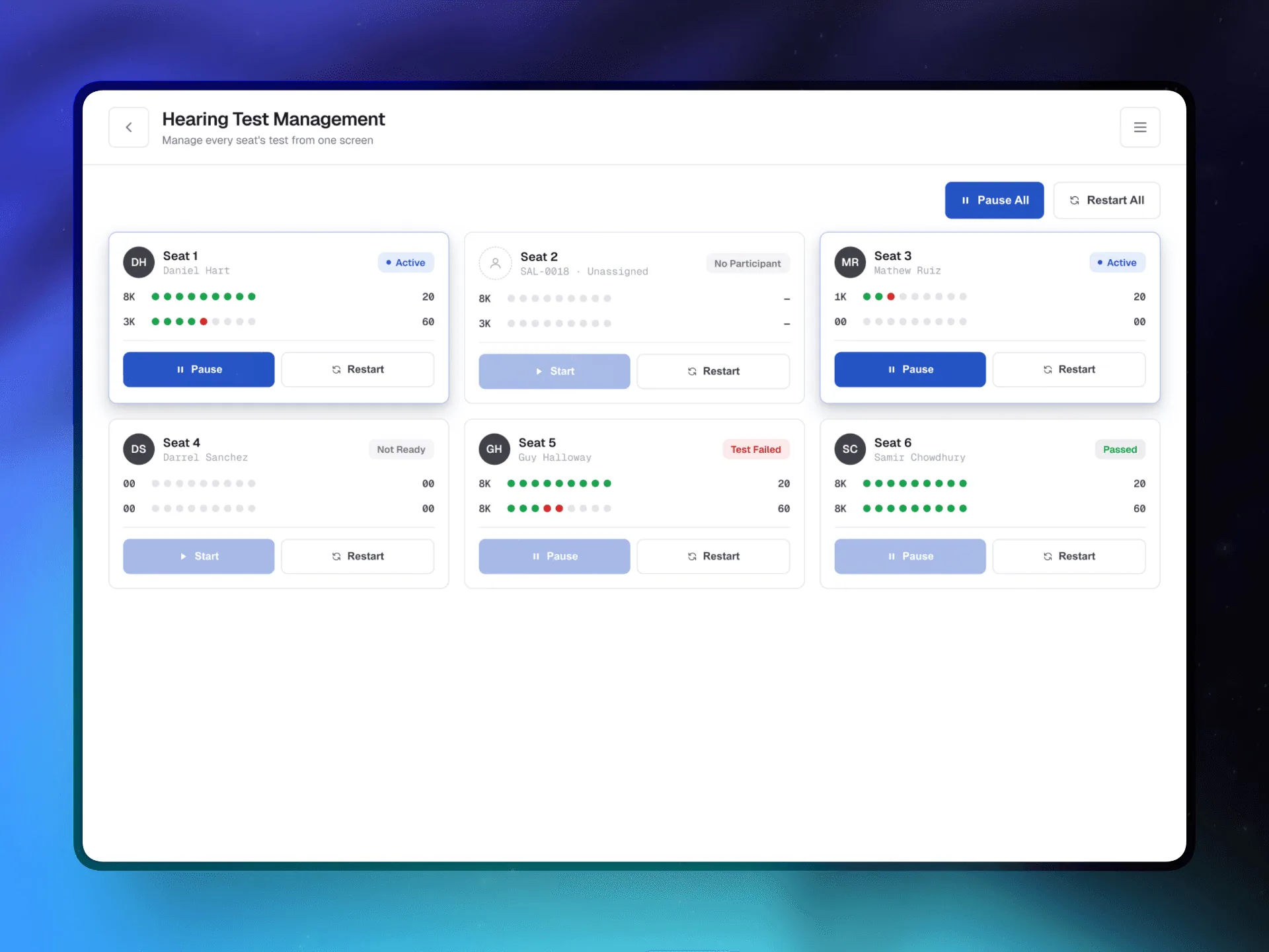
A dot-timeline per frequency, per ear. A failed threshold shows up red, right there, instead of in a report after the fact.
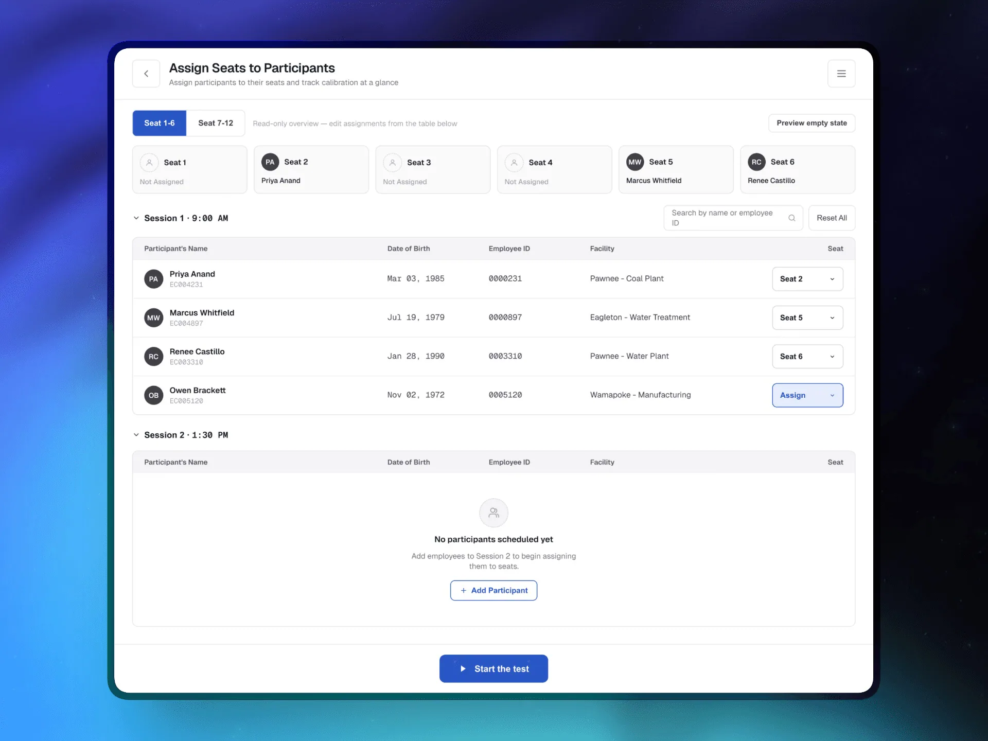
A read-only strip for a glance at who’s where, and an editable, session-grouped table underneath for the actual work. In the original, both were editable — and technicians didn’t know which one to touch.
Login, setup, testing — each step in the right order, nothing where it wasn’t needed.
Across 20–50 technicians running sessions with up to eight participants each.
Faster session setup — ~20 min to under 10
Recovered per technician per site day
Guided steps cover ~90% of the process
Seats, one interaction model — no retraining
New technicians no longer need a supervisor. The flow guides itself.
Real-time calibration status per seat — Calibrated, Needs Calibration, Error — removed a class of silent failure. In occupational health, an invalid test isn’t a bad experience. It’s a compliance problem.
The design removes obvious friction. Usage data is what tells you whether technicians actually use it the way it was intended.
Per session — and whether technicians use the collapsed seat view or ignore it.
More steps in exchange for clarity was right for experienced users. New technicians need their own check that the guided flow doesn’t create anxiety.