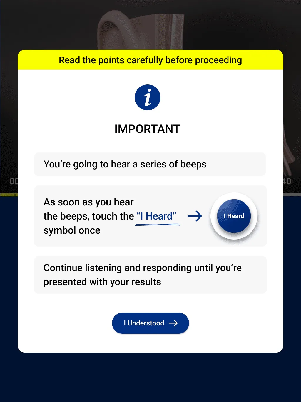
Skip to content

Ralux

Hearing tests simple enough for someone who’s never used a tablet.

A tablet app that lets employees self-administer hearing tests at their facility with a handheld audiometer — redesigned for low tech literacy, with visual cues and minimal text.
Role
Product Designer
Timeline
8 weeks
Platform
Web · iPad app
Users
Factory & construction workers
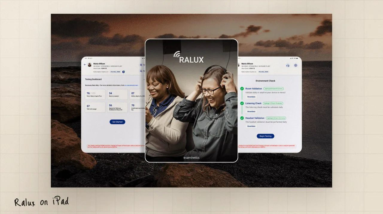
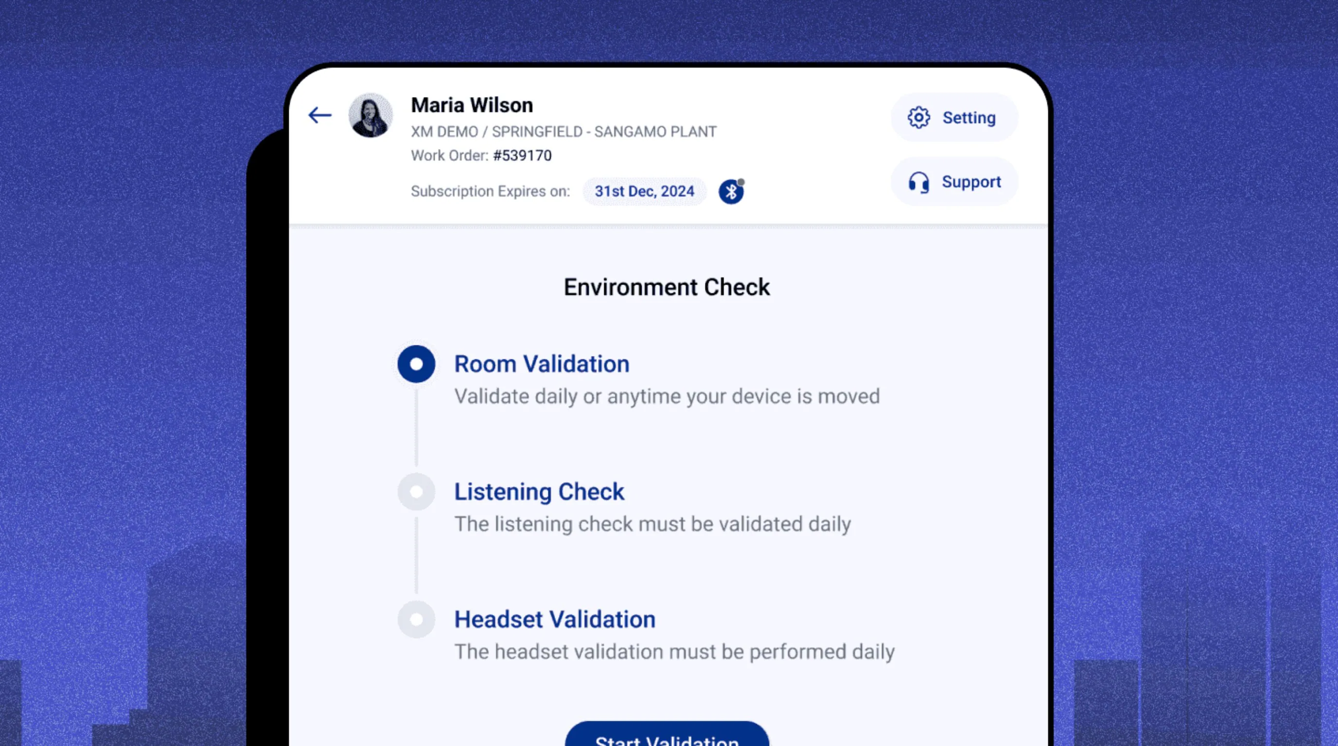
Ralux environment check screen on an iPad
Case study · accessibility≈ 3 min read
The problem, in numbers

Why the old app needed a technician.

0162%

of users needed a technician’s help to navigate

0230%

of users are aged 40–70

032/6

Interviewees couldn’t get past login

Client data + my own interviews ✦Research baseline
The short version
01 · Problem

Most users couldn’t take the test without help.

62% needed a technician to navigate, and two of six interviewees couldn’t even log in. Many users are 40–70 and new to tablets.

02 · What I did

Rebuilt five key screens around one clear action each.

Visual cues over text, neutral colours for sensitive questions, and a buzzer-like test button that vibrates.

03 · Result

A test flow people can run on their own.

Refined through multiple rounds of client and end-user feedback, from login to a finished test.

My role

Product Designer, data to tested screens.

An 8-week redesign. I started from the client’s data, interviewed people who matched the real user profile, and rebuilt the screens where testing showed the flow breaking down.

  1. 1

    Client data

    Where users needed technicians, and how often.

  2. 2

    Interviews

    5–6 people matching the real user profile.

  3. 3

    Usability testing

    Feedback from clients and end users.

  4. 4

    Redesign

    Five key screens, one clear action each.

  5. 5

    Flows & sitemap

    Every path, from login to a finished test.

01Context

Simple enough for someone who has never touched a tablet.

Ralux lets employees self-administer on-demand hearing tests at their facility with a handheld audiometer — often factory or construction workers.
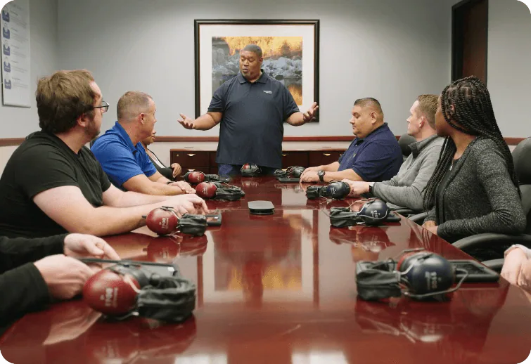
Employees in a meeting room at their facility
The people Ralux is for

Who the redesign had to work for

  • 01Low tech literacy

    Many users are unfamiliar with mobile devices and tablets.

  • 02Limited education

    Instructions had to work with minimal text.

  • 03Visual and hearing challenges

    Small text and icon-only cues fail exactly these users.

  • 04Testing independently

    The test had to run without a technician standing by.

02User research

Where the confusion really happened.

I started with the client’s data, then interviewed 5–6 people who matched the real user profile — they showed what the numbers couldn’t.

I.01

62% struggle to navigate

Users often needed a technician. Six of eight technicians also struggled to start tests with the old interface.

I.02

30% are aged 40–70

Many are new to tablets — a simplified, intuitive design was essential.

I.03

2 of 6 couldn’t get past login

Critical usability issues in both the login and the testing phases.

Two of six couldn’t log in. The other four couldn’t finish.

Of the six interviewees, none completed the test on their own. The fix had to cover the whole path — login, setup and the test itself.

03Usability testing & solutions

Five screens, rebuilt around one clear action.

Feedback from clients and end users showed exactly where things broke down. The fixes: clearer navigation, stronger visual cues, and images wherever text wasn’t needed.
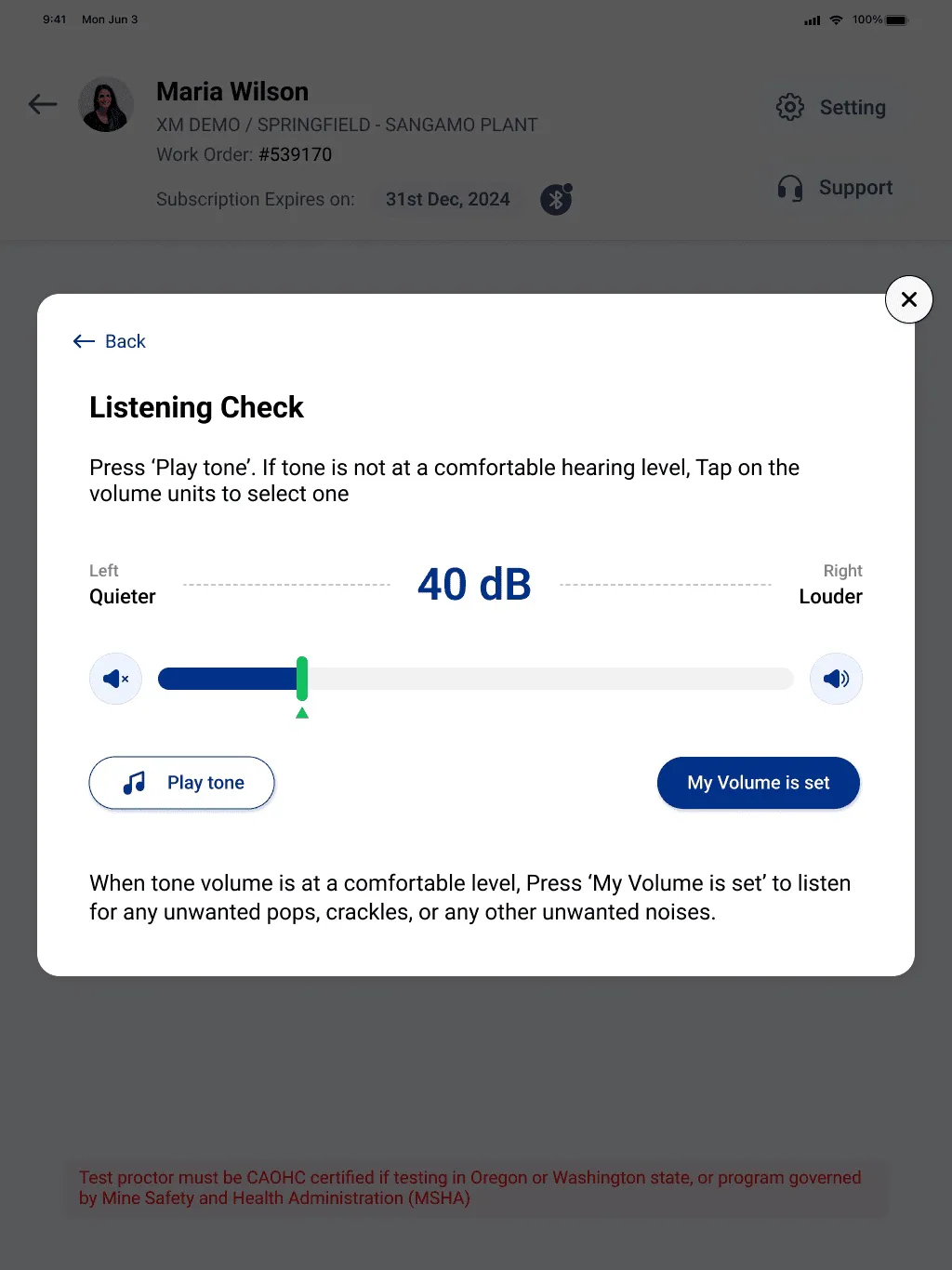
01

Technician’s screen

Before
Before: Overloaded text, unclear navigation, buried actions and cluttered controls confused users.
Before. Overloaded text, unclear navigation, buried actions and cluttered controls confused users.
After
After: Streamlined text, intuitive icons and buttons, clear hierarchy and a minimal layout.
After. Streamlined text, intuitive icons and buttons, clear hierarchy and a minimal layout.
02

Case history questions

Before
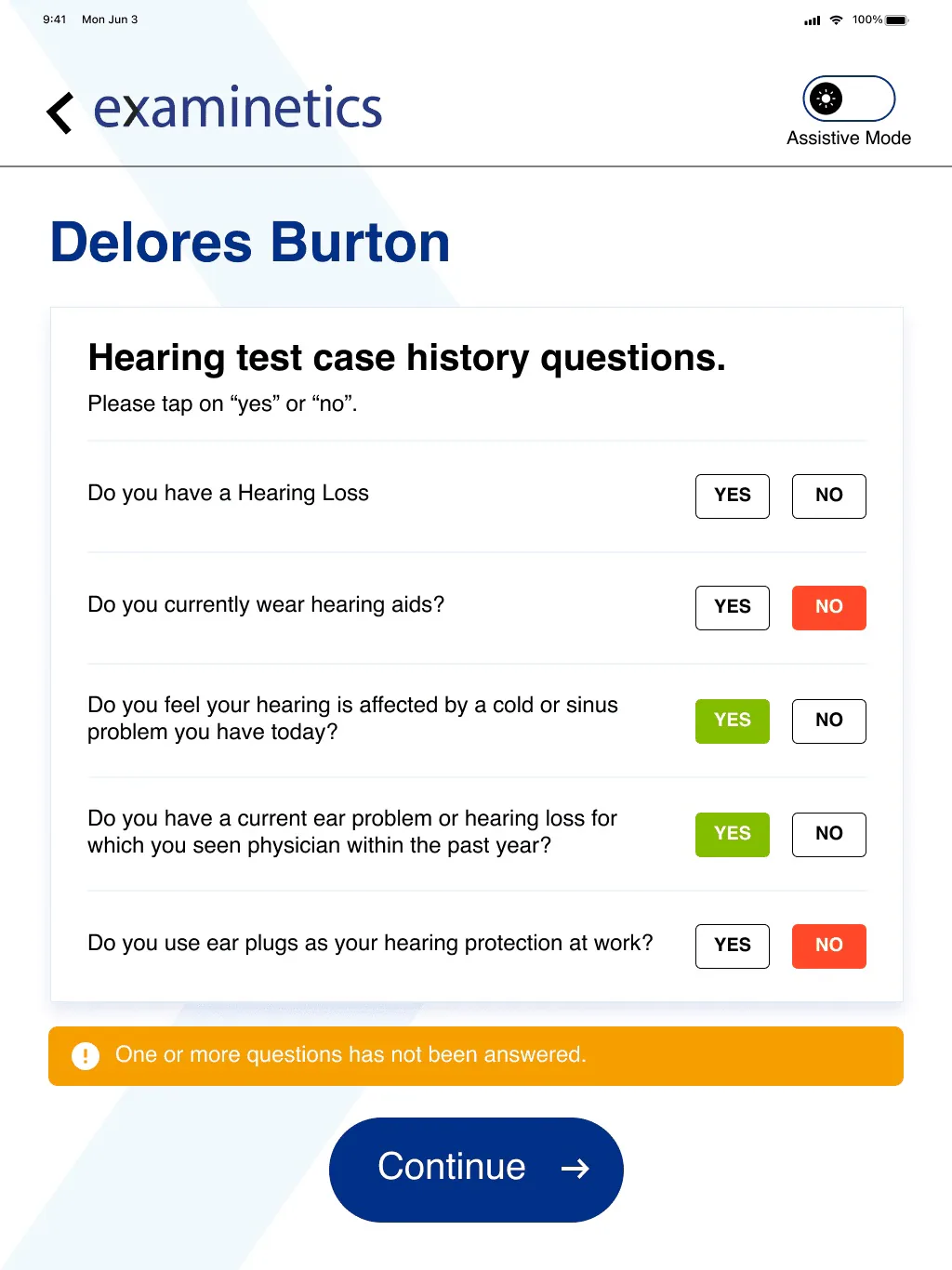
Before: Red/green “Yes/No” buttons — red for “Yes” on sensitive questions like hearing loss — risked stigmatising users.
Before. Red/green “Yes/No” buttons — red for “Yes” on sensitive questions like hearing loss — risked stigmatising users.
After
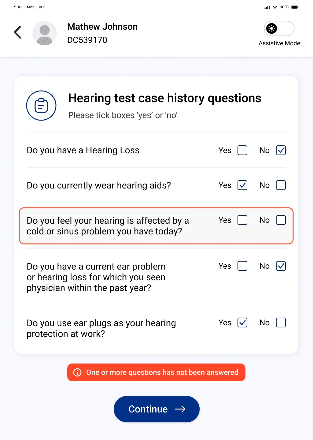
After: Neutral colours, physical box-like forms for a familiar feel, and concise, empathetic instructions.
After. Neutral colours, physical box-like forms for a familiar feel, and concise, empathetic instructions.
03

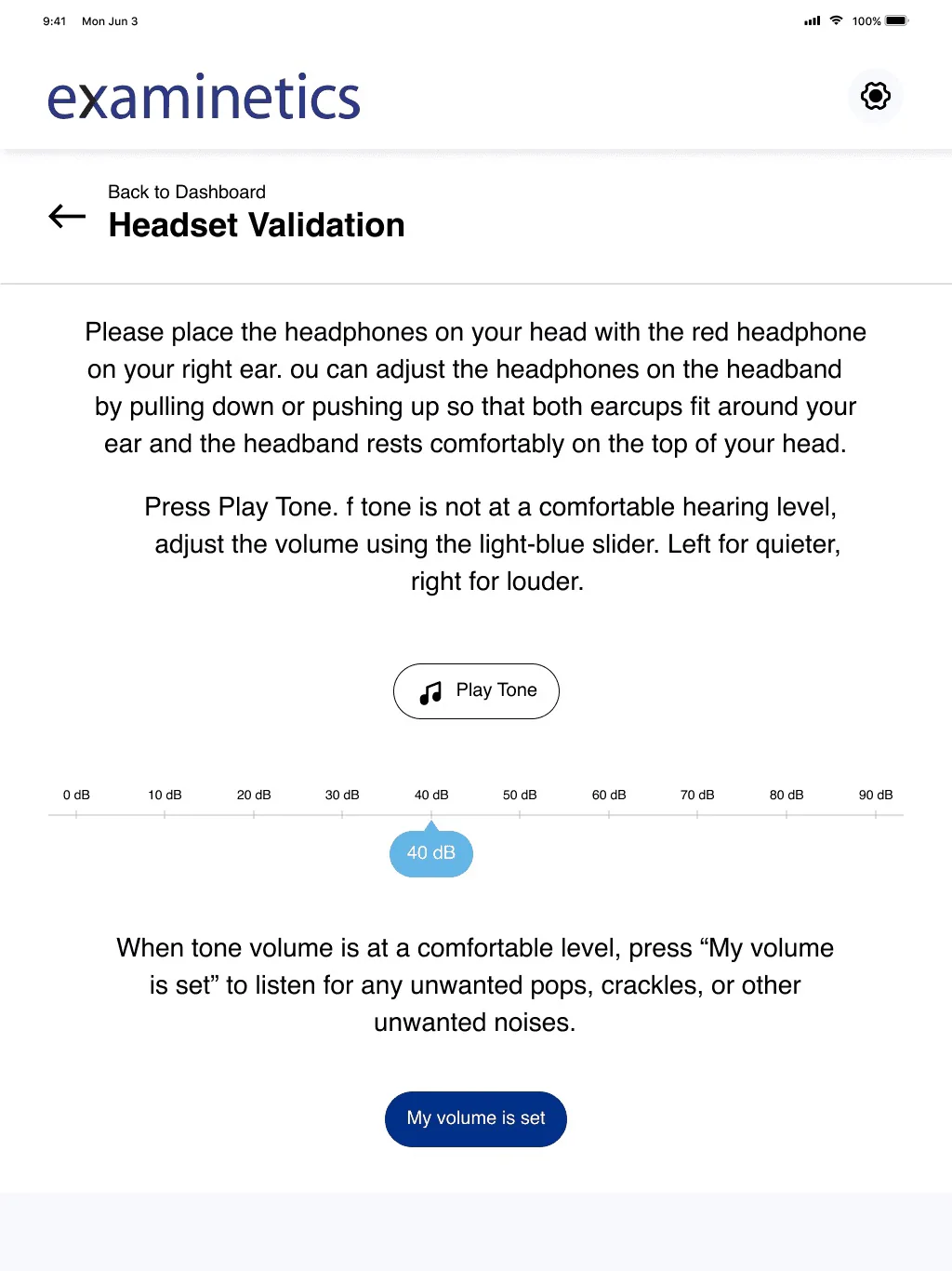
Headphones setup

Before
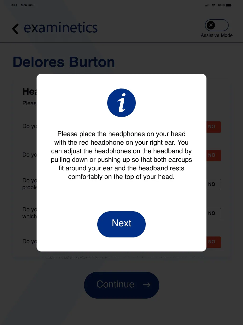
Before: Overwhelming instructions to read; the UI and navigation weren’t clear.
Before. Overwhelming instructions to read; the UI and navigation weren’t clear.
After
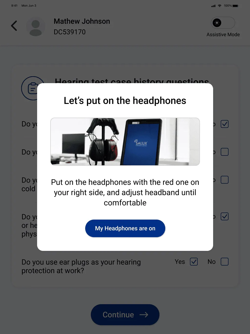
After: A spot-on title with a reference image, clear instructions and a more relevant button label than “Next”.
After. A spot-on title with a reference image, clear instructions and a more relevant button label than “Next”.
04

Test instructions

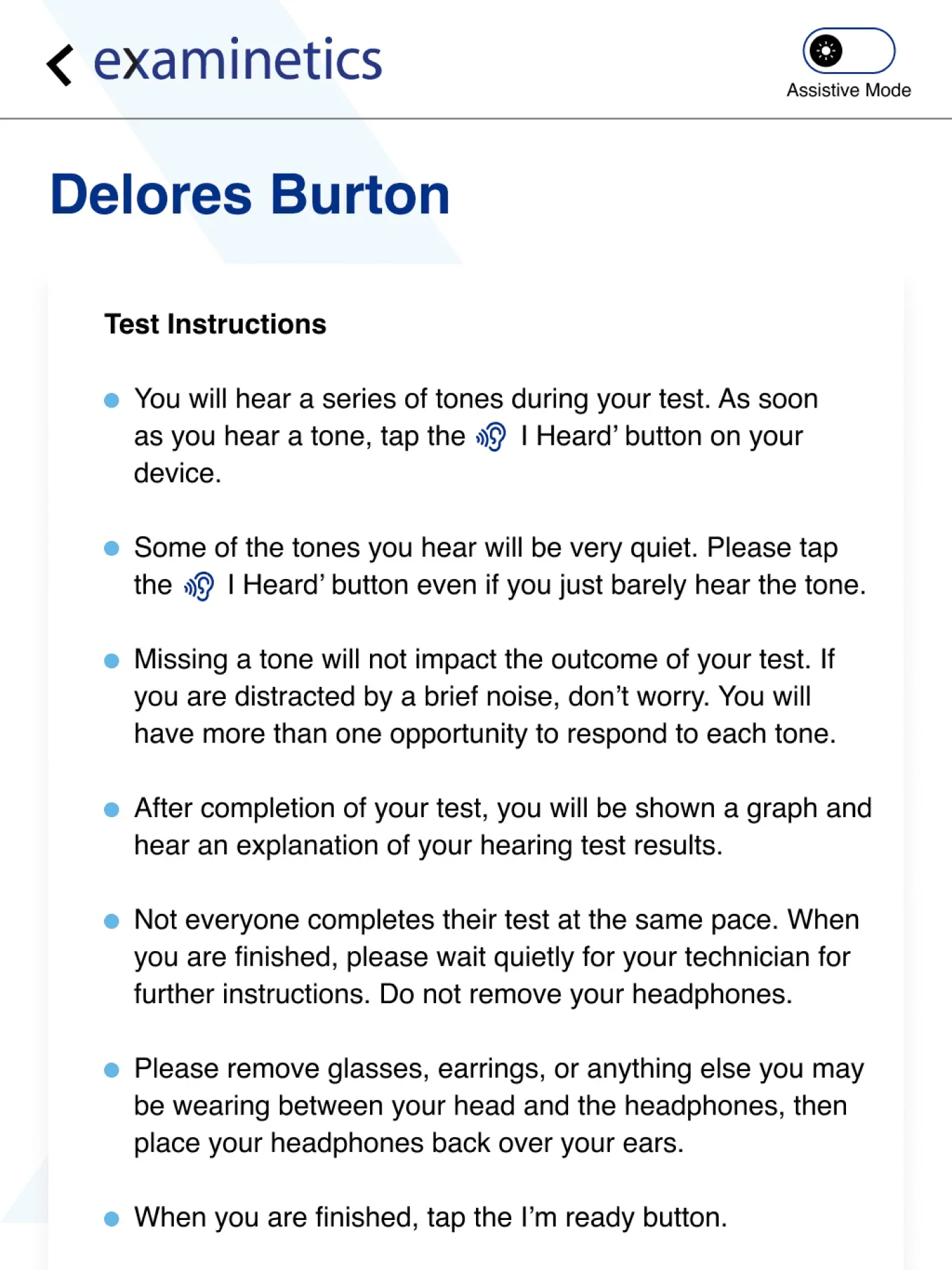
Before
Before: Too many instructions for users who already find the app difficult.
Before. Too many instructions for users who already find the app difficult.
After
After: Clear steps with highlighted navigation, and a high-contrast yellow-and-black title users won’t skip.
After. Clear steps with highlighted navigation, and a high-contrast yellow-and-black title users won’t skip.
05

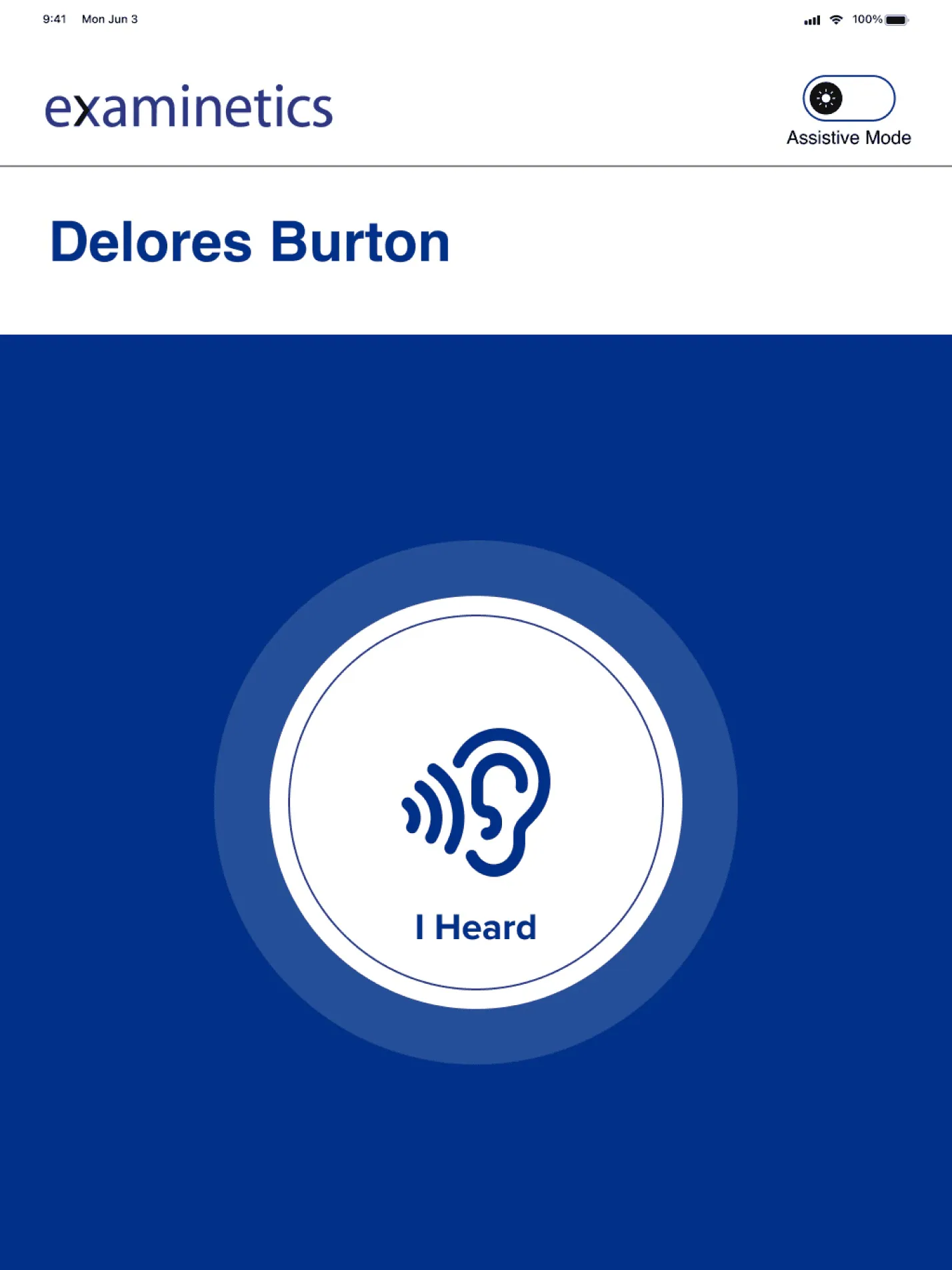
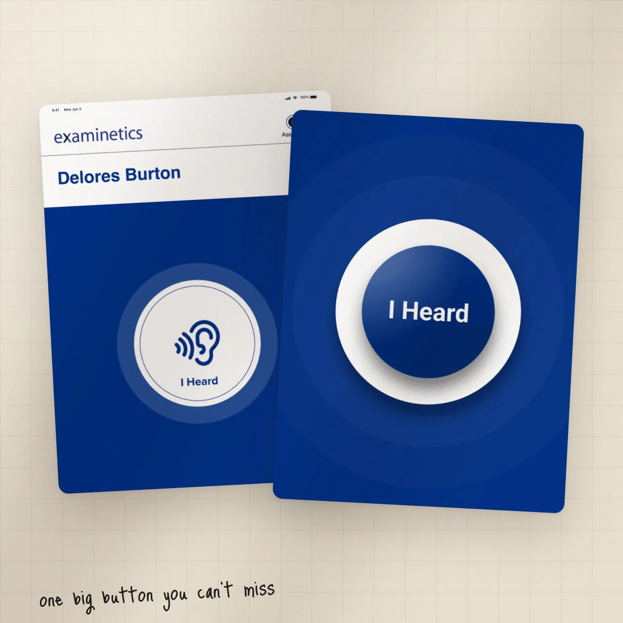
The test itself

Before
Before: Small text with an ear icon that low-vision users may not read, plus unnecessary headers.
Before. Small text with an ear icon that low-vision users may not read, plus unnecessary headers.
After
After: One button that looks like a buzzer — obviously pressable — with a vibration when pressed.
After. One button that looks like a buzzer — obviously pressable — with a vibration when pressed.
04Final designs

Every flow, from login to a finished test.

Multiple rounds of feedback, until each flow could be followed without stopping to think.
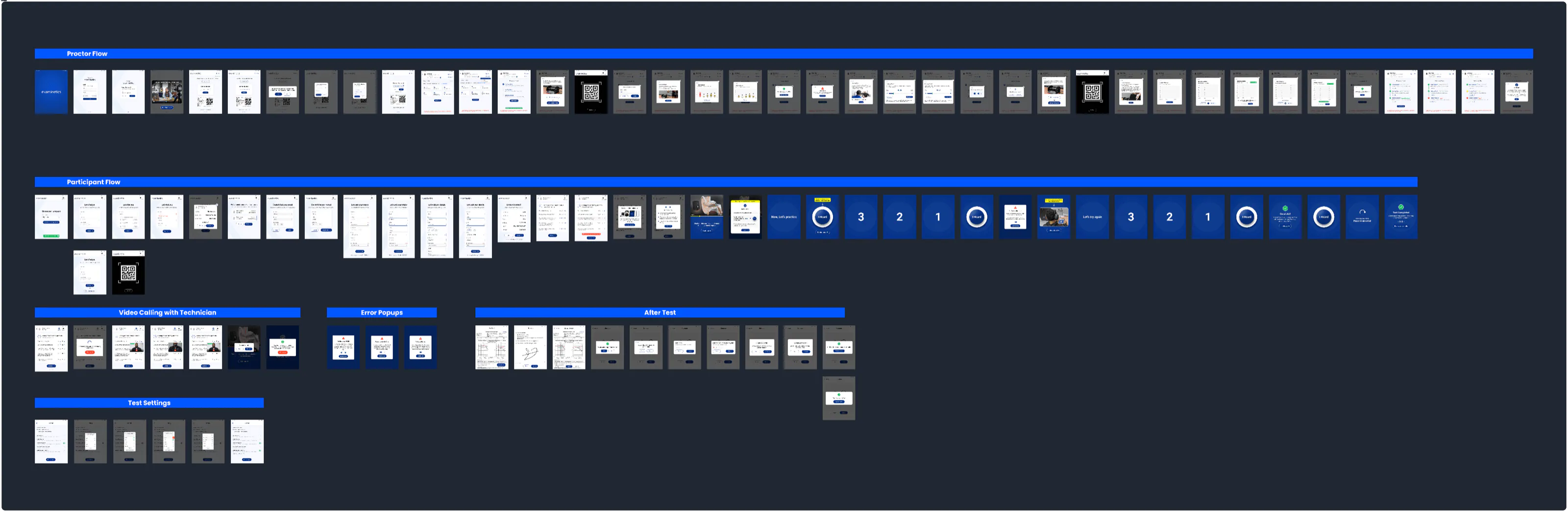
Ralux end-to-end user flow
User flows
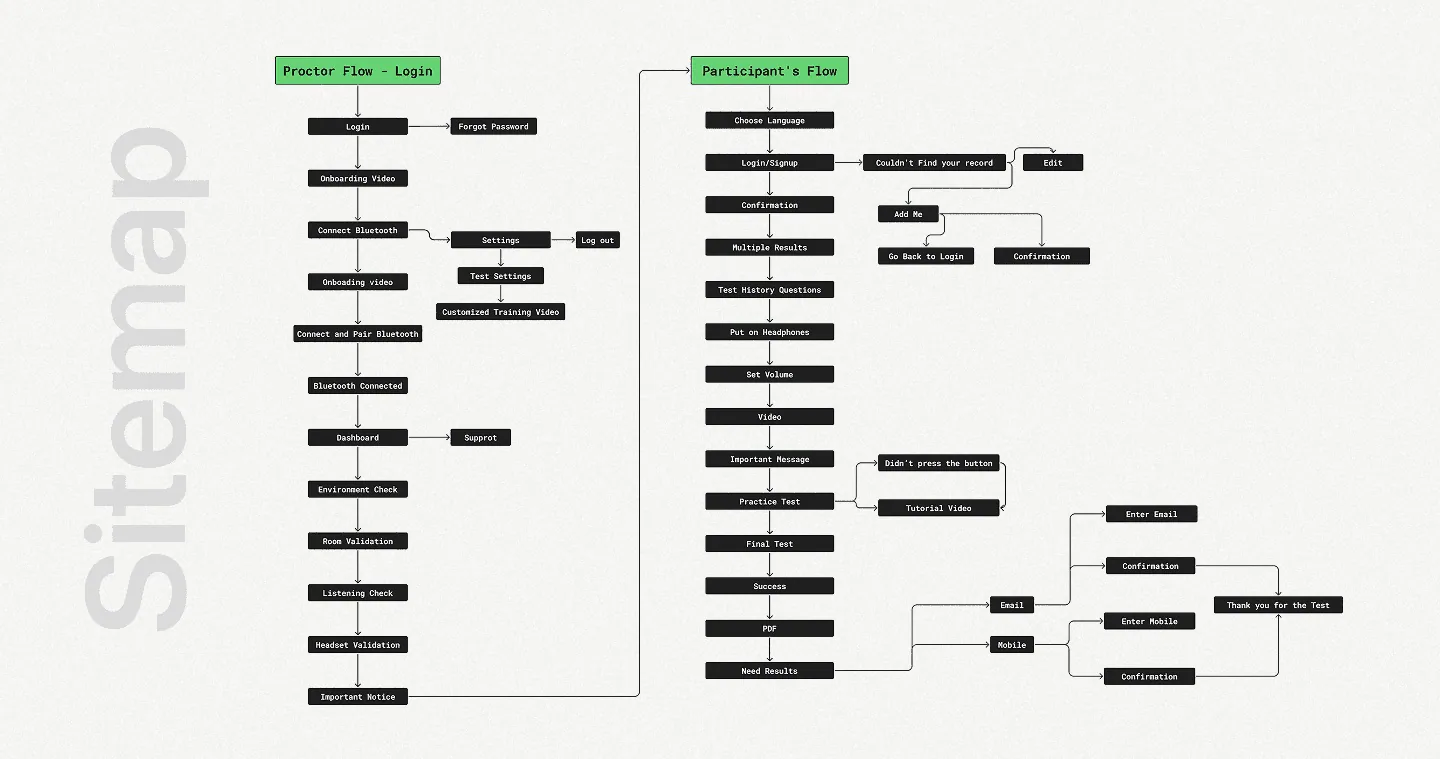
Ralux sitemap
Sitemap
Ralux app on an iPad
Ralux on iPad
05Outcome

A hearing test people can run on their own.

Research and testing turned a technician-dependent flow into one built for independence.

5

Key screens rebuilt around one clear action

1

Buzzer-style button on the test screen

0

Red “Yes” buttons on sensitive questions

8

Weeks from client data to final flows

Visual cues over text. One action per screen. No one left waiting for a technician.

The result is an accessible interface with visual cues, minimal text and easy navigation — refined through multiple rounds of client and end-user feedback.
Ralux “I Heard” button, before and after

Designing something complex? Let’s talk.

Résumé ↗