Most hearing people don’t sign - and no app covered all three jobs.
Existing apps cover slivers: one sign language, no real-time mode, no emergency path. Users stitch together three or more tools.
Real-time sign language translation, built DGS-first.
An AI translation app that lets a Deaf student in Berlin order coffee, talk to a doctor and ask for help — without writing it down first.
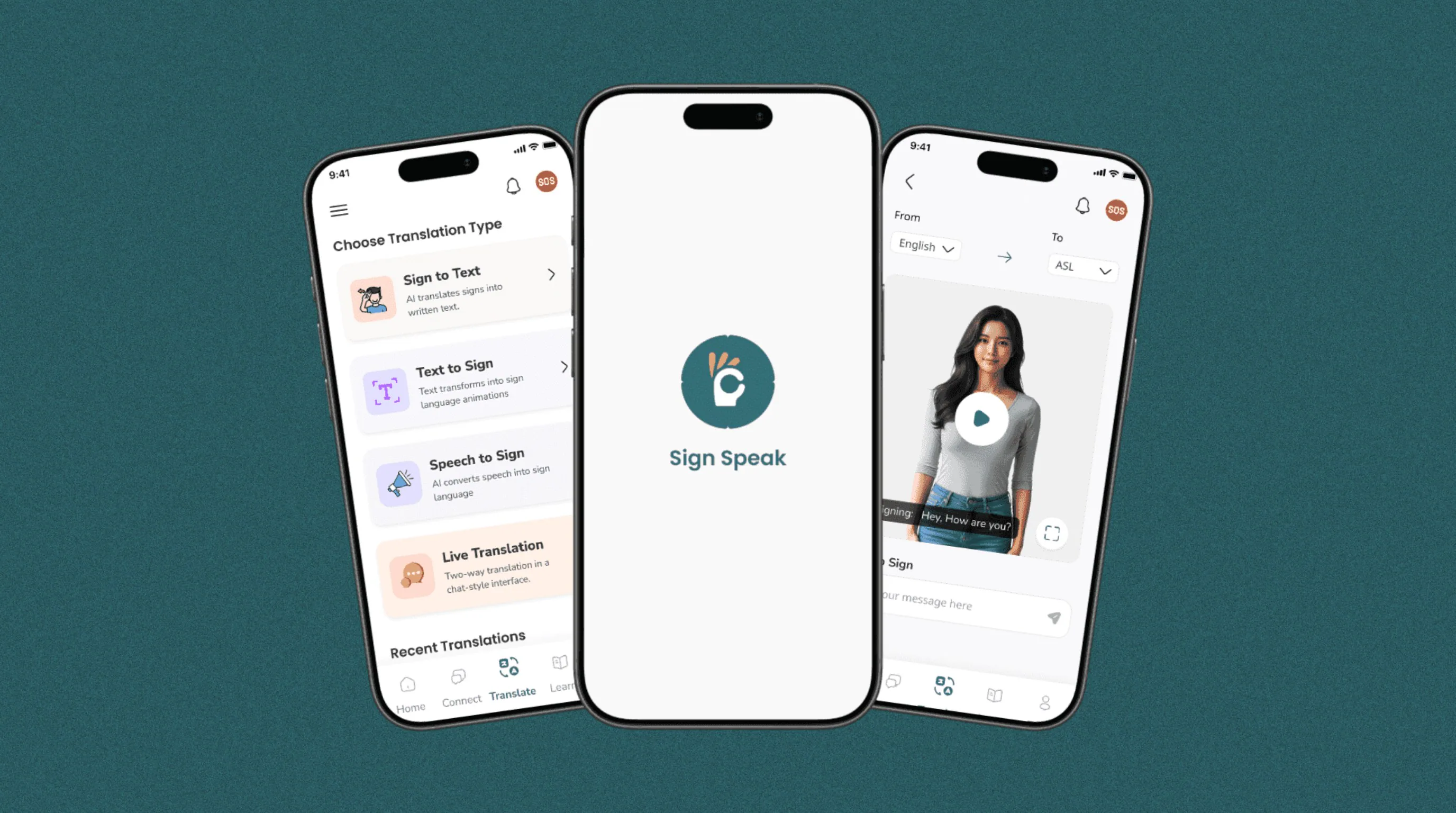
Screens in a component-driven design system
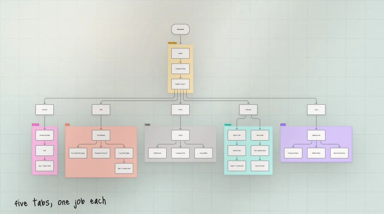
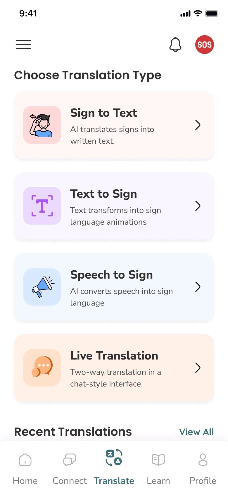
Tabs, each doing one clear job
Final grade from a jury of three
Existing apps cover slivers: one sign language, no real-time mode, no emergency path. Users stitch together three or more tools.
A research-first foundation, UX laws mapped to decisions, and an AI layer that always shows its confidence.
Graded 1.8 by a jury of three professors. An academic project, so there are no live usage metrics.
A Master’s project, defended in front of a jury of three. I used Claude for literature synthesis and audit structuring and Figma AI for faster variants — every design decision stayed mine.
Literature, population data, EU reports and a competitive audit.
Five tabs, defined before any screen.
Confidence, latency and failure states, designed on purpose.
Tokens, type ramps and components for 90+ screens.
End to end in Figma, from onboarding to SOS.
470 million Deaf and hard-of-hearing people — a projected 900 million by 2050. Most hearing people don’t sign, and most public spaces have no interpreter.
WHO: roughly 1 in 10 people will live with disabling hearing loss. Existing apps treat them as a niche.
DGS-first strategy, designed for the German Deaf community first
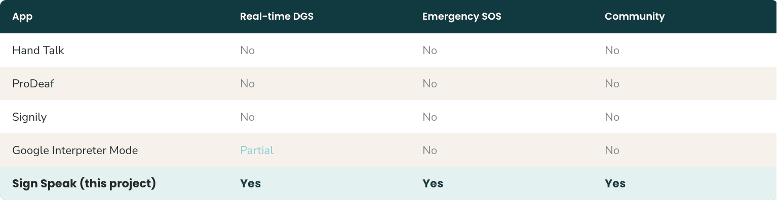
Hand Talk, ProDeaf, Signily, Google Interpreter Mode — none combine real-time DGS, an emergency SOS and a learning community.
One 5-tab app, each tab doing one job clearly
Typing a name, condition and location while in distress is a failure mode that maps to real harm.
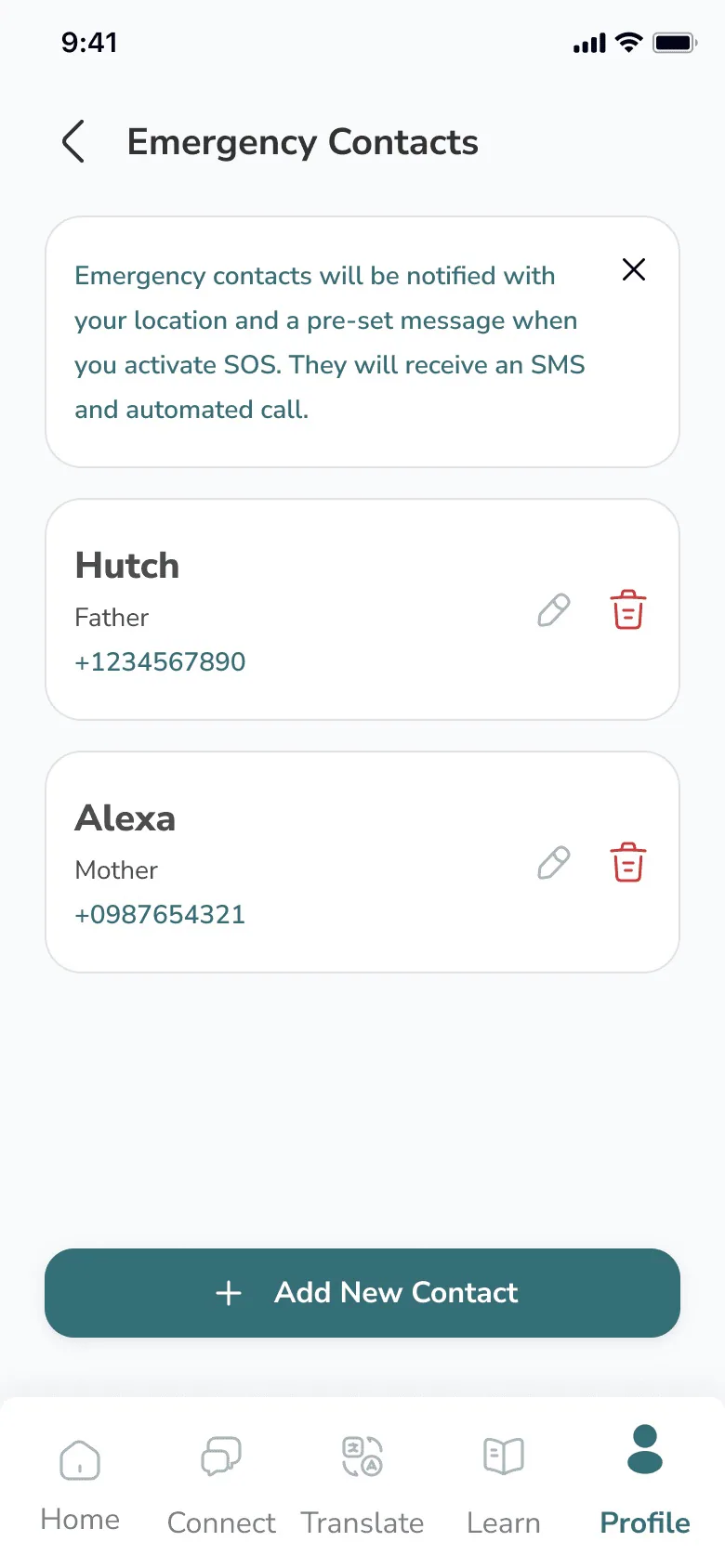
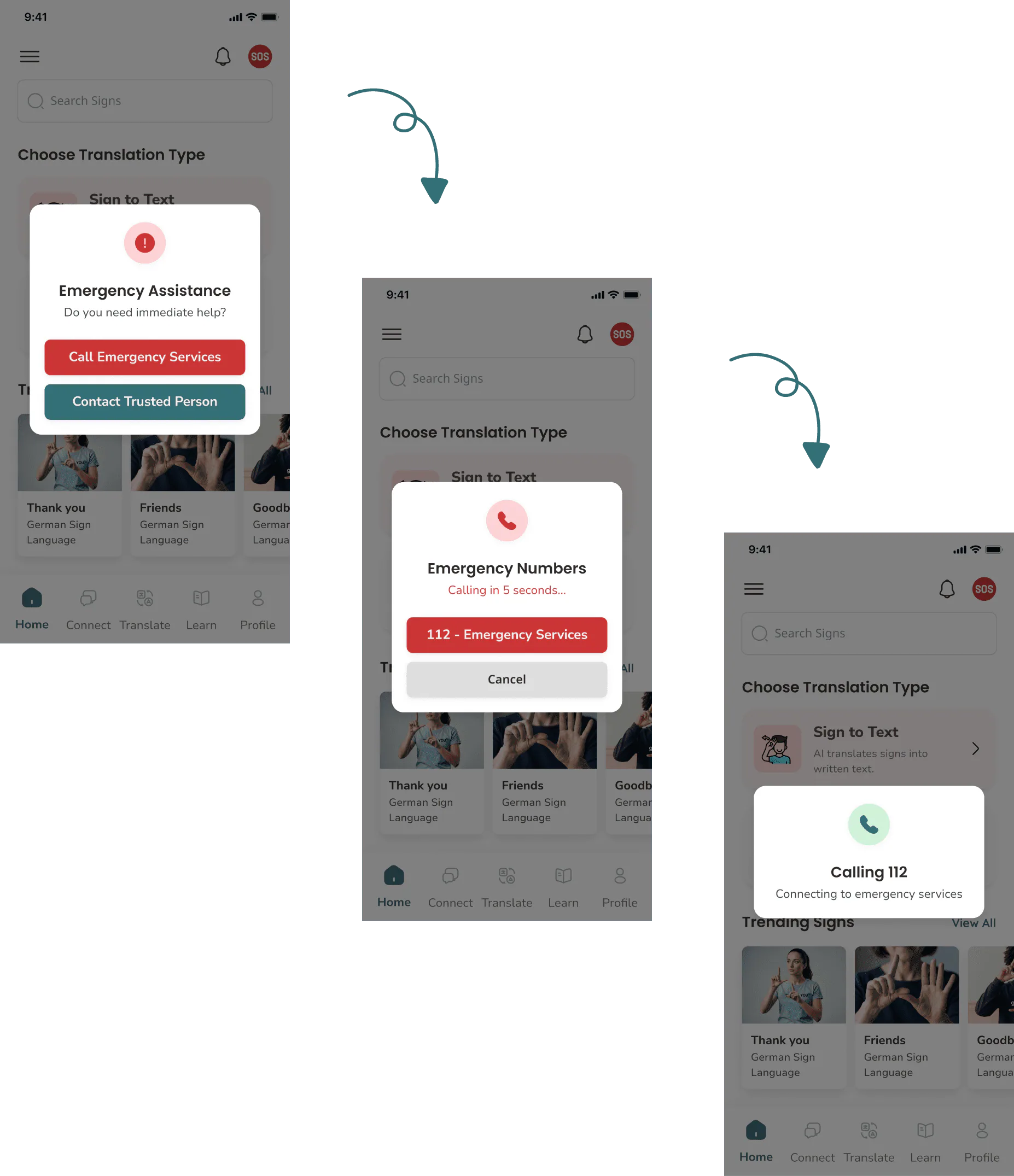
One-tap SOS: pre-written status, confirm-and-send
German Sign Language has its own grammar and regional variation. ASL-default tools strip out nuance.
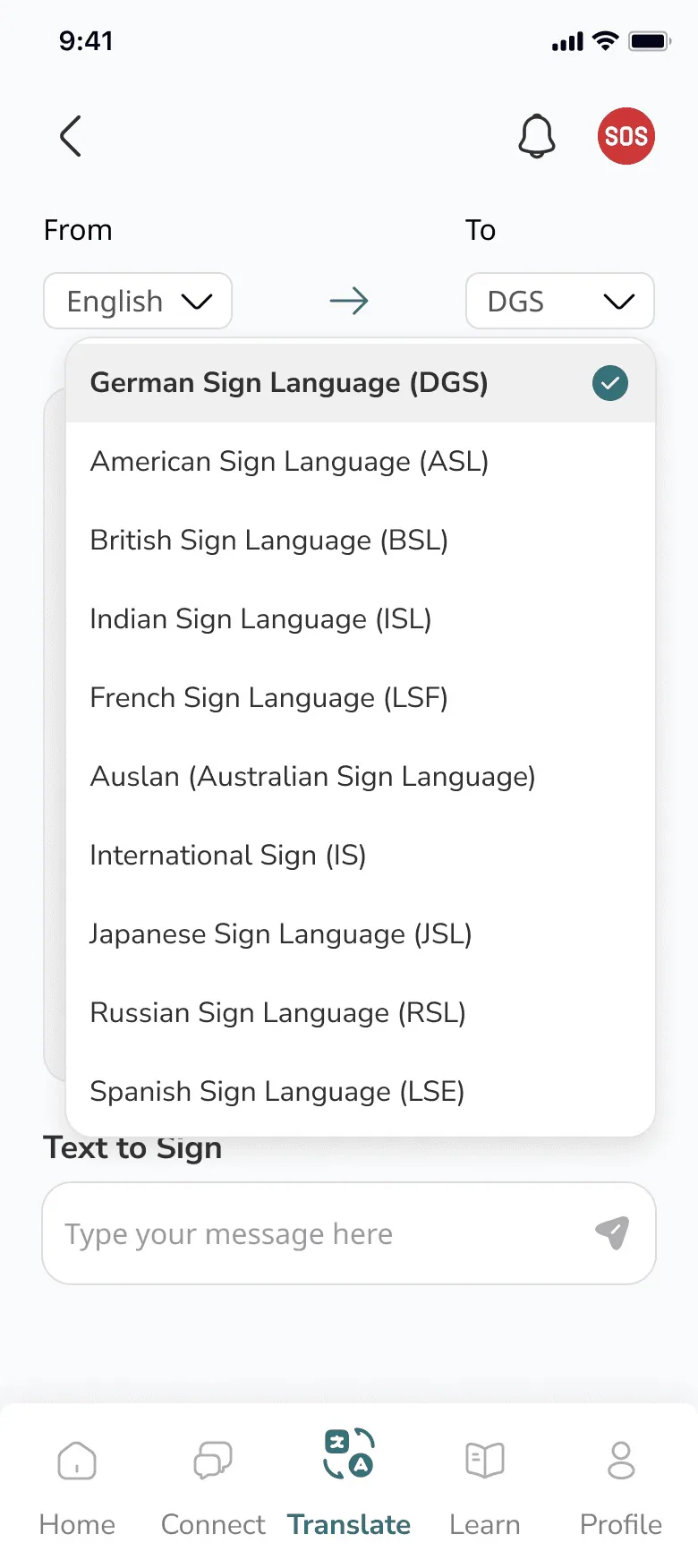
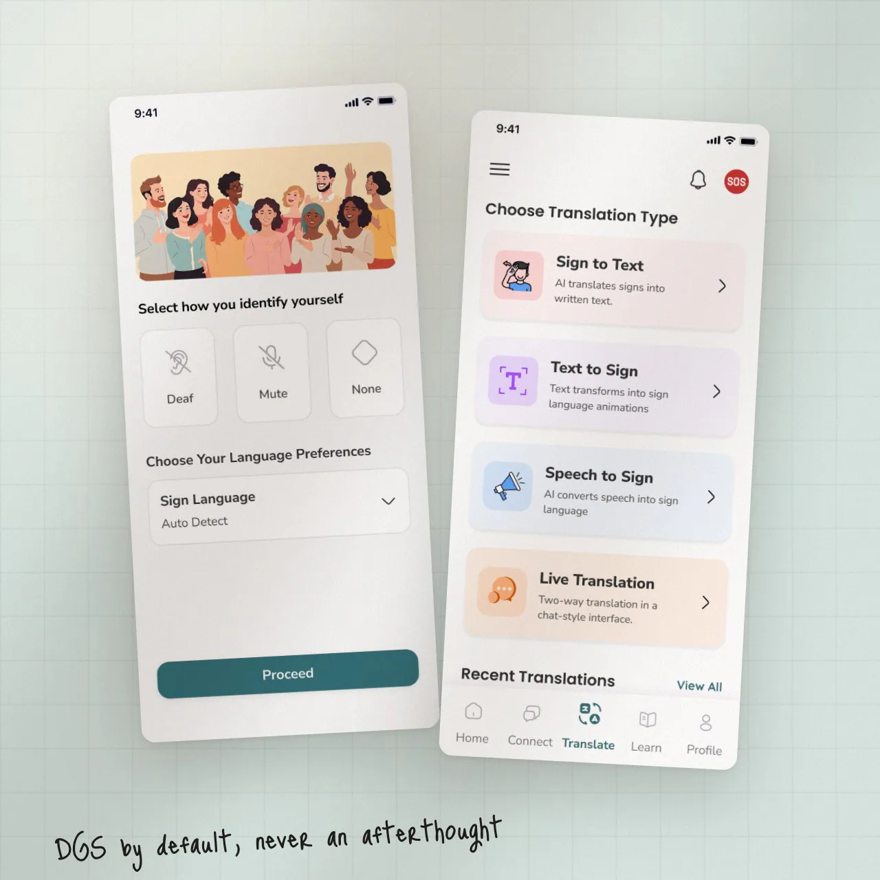
DGS by default, ASL opt-in, confidence on every translation
Four research threads shaped the product before a single screen was drawn.
I couldn’t recruit Deaf participants for primary interviews within the project window. Findings and personas are synthesised from peer-reviewed research, public Deaf-community forums and published reports — all cited. Personas are composites, not real interviewees.
Mis-triage of Deaf patients, interpreter shortages in EU emergency services, lip-reading fatigue.
WHO and WFD reports — 470M today, ~900M by 2050, and a persistent education gap.
The EUD barriers report informed the DGS-first decision and the emergency flow.
Four apps audited. None combined real-time DGS, emergency support and a learning hub.
From “another translator” to a three-job product.
The research reframed the project into translate, emergency and community — built AI-translation-first. Everything that follows is downstream of that reframing.
SourcesWHO 2023WFD 2021EUD 2022McKee 2015Sharma & Gupta 2022
Composites synthesised from the research. Each one maps to a distinct top risk — and a distinct design response.
A doctor talking past him.
Big tap targets, high contrast, one-tap SOS, a speech-to-text card to hand a doctor.
Typing his name to a paramedic.
Pre-written status, one-tap SOS and an offline fallback for the SOS path.
Mis-triage in lectures.
DGS as default, real-time captions in lectures, chat that preserves signing tone.
“Give me a tool that respects DGS as a real language - and doesn’t make me prove I deserve to be understood.”
Shared job-to-be-done across all three personas. Quotes are illustrative — paraphrased from cited sources, not transcribed from interviews.
The IA was defined before any screen design and held through every iteration. DGS is the default; ASL, BSL, ISL and others are opt-in.
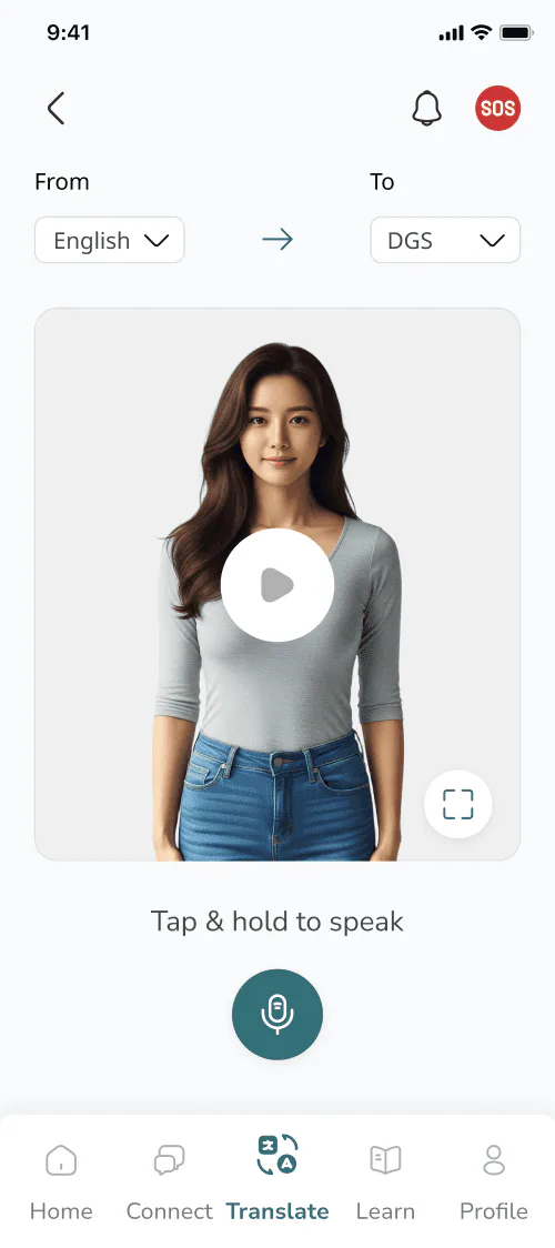
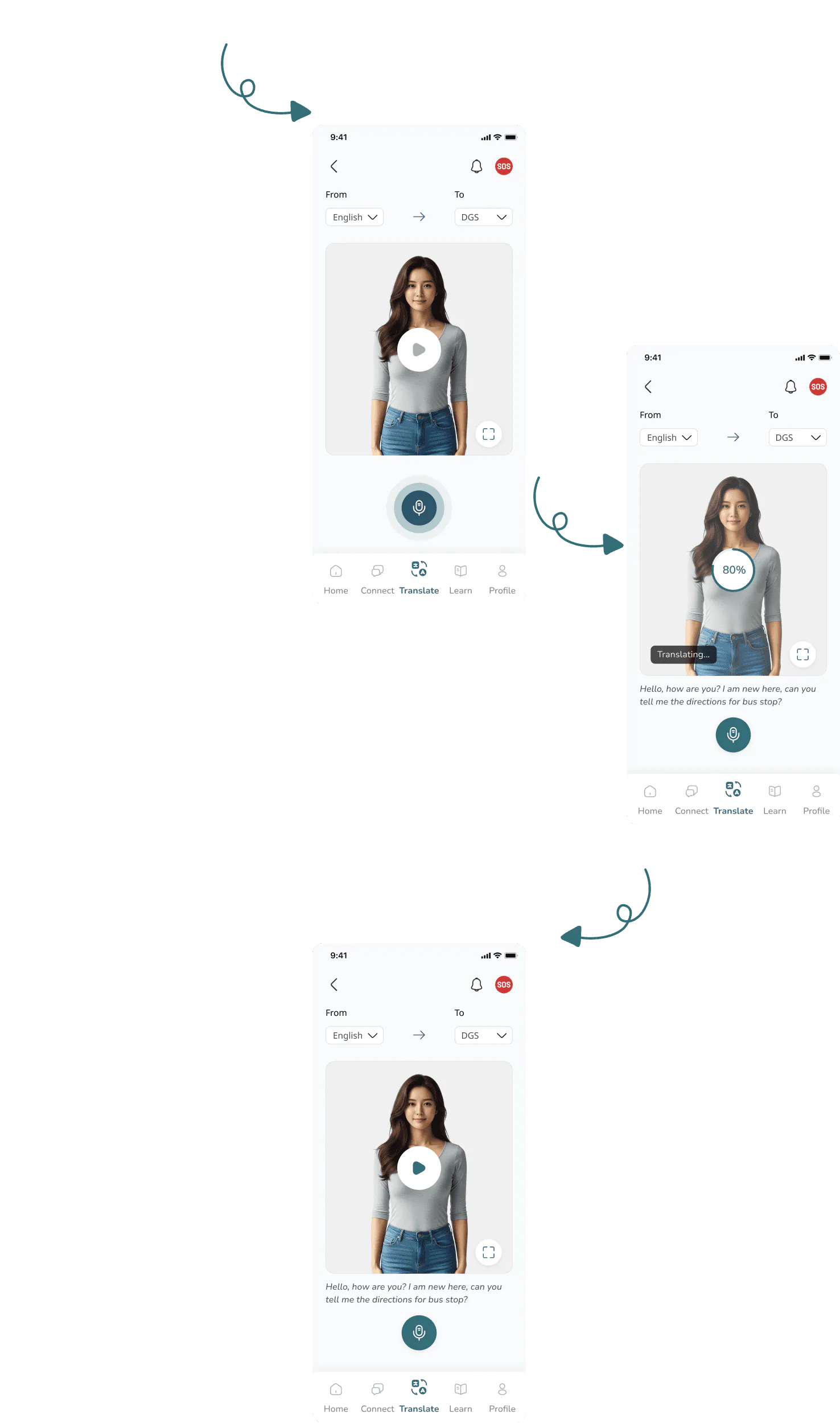
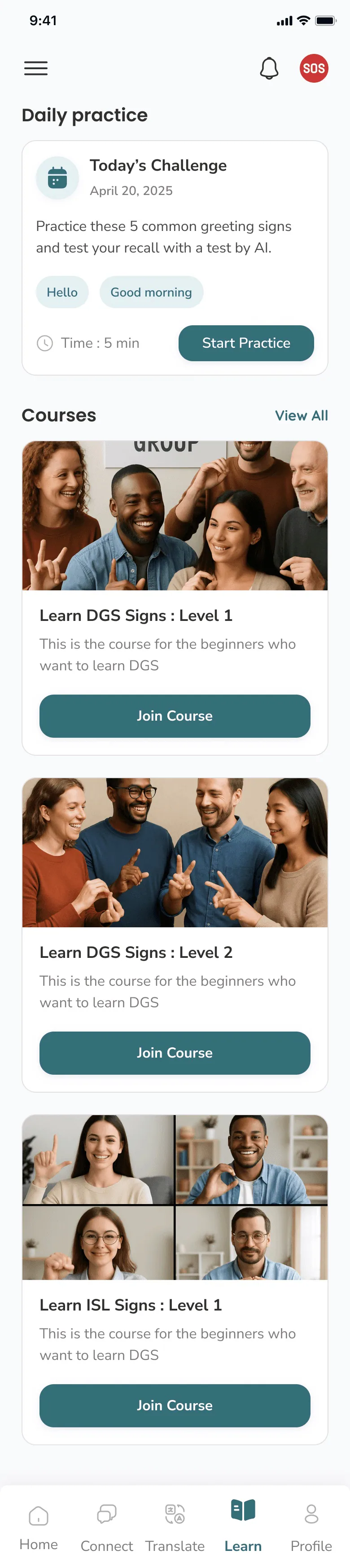
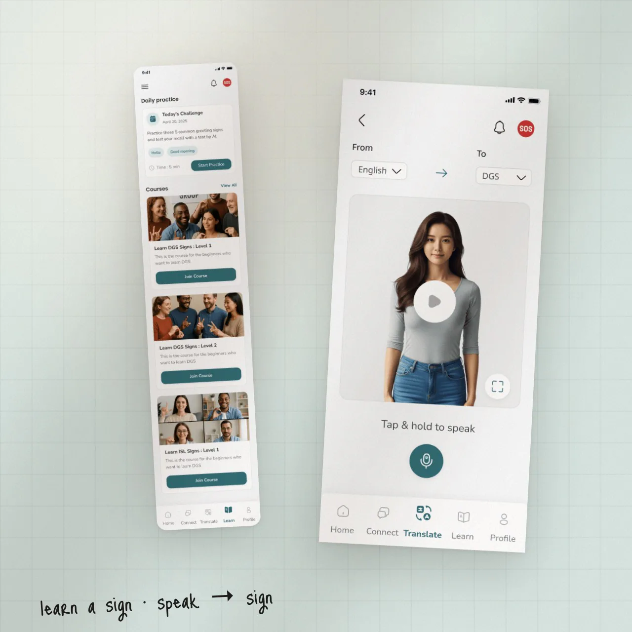
Sign↔Text in real time, with confidence shown. About 70% of session time.
Practice cards, saved translations and community-sourced signs.
Chat that preserves signing tone; group chat for Deaf-led communities.
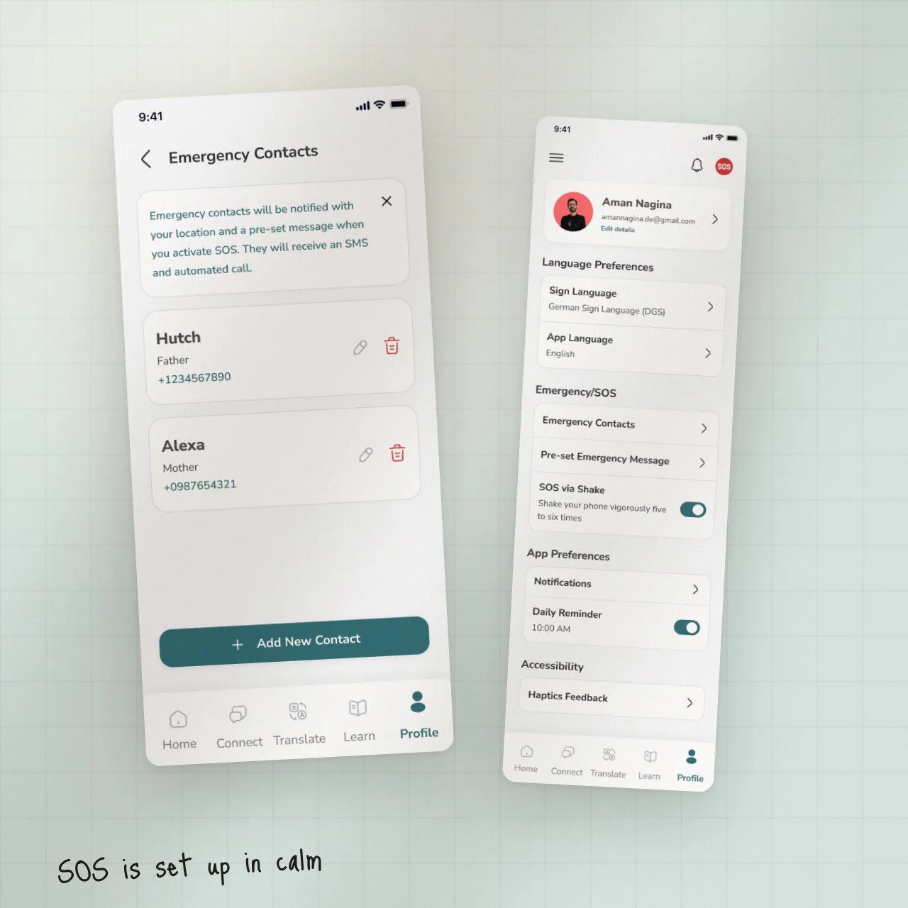
One-tap emergency, for the moment speech is not an option.
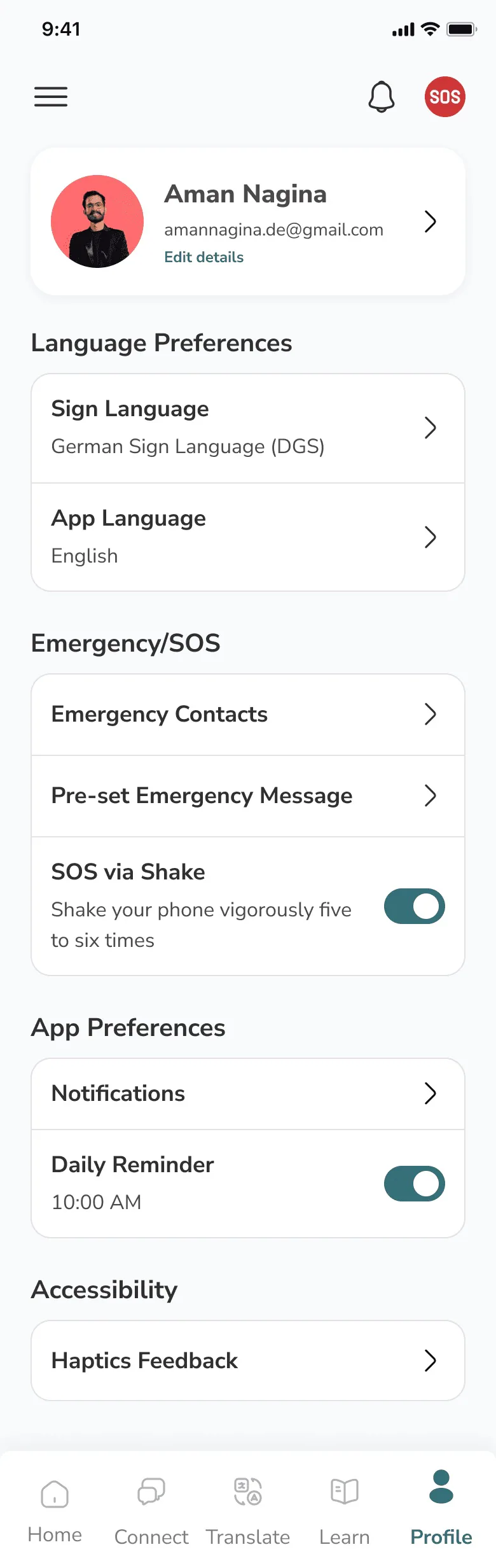
Trusted contacts, pre-written status and accessibility preferences.
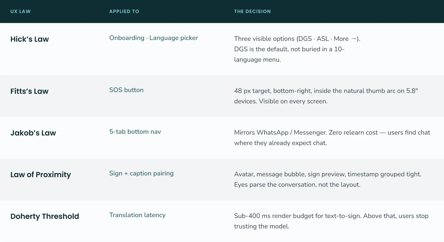
Listing UX laws on a portfolio is easy. Showing where each one made a decision is the hard part — and it made the choices defensible to a non-design jury.
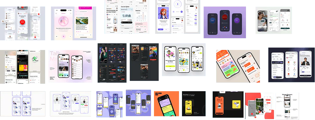
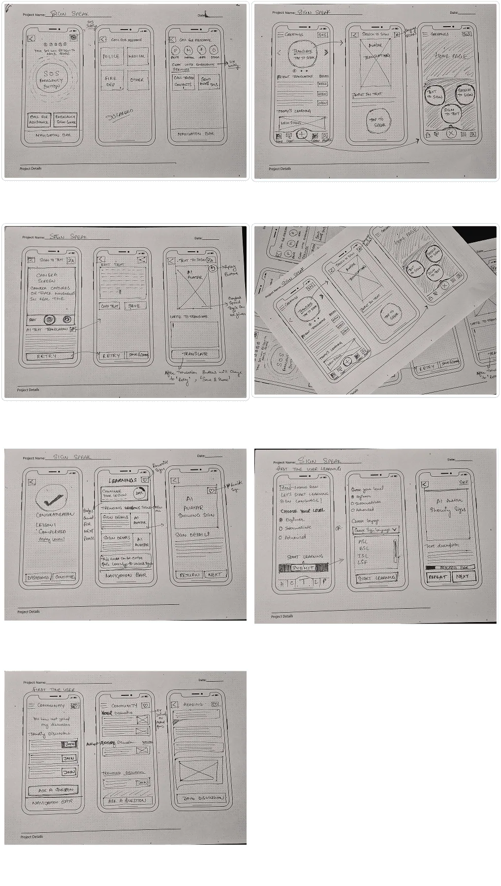
Three commitments locked the visual language early — teal as a trust signal, high contrast everywhere, no decorative complexity. Then paper wireframes, to lock hierarchy and navigation before any visual decision.
Sign Speak runs on a real-time translation model. That model has confidence, latency and failure modes — and the UI surfaces all three on purpose.
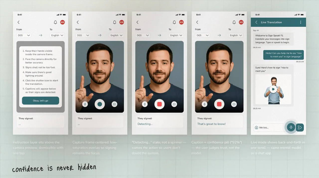
The pill turns teal at 90%+, amber below it with a “Best guess:” prefix. Users always see what the model is sure about — and what it isn’t.
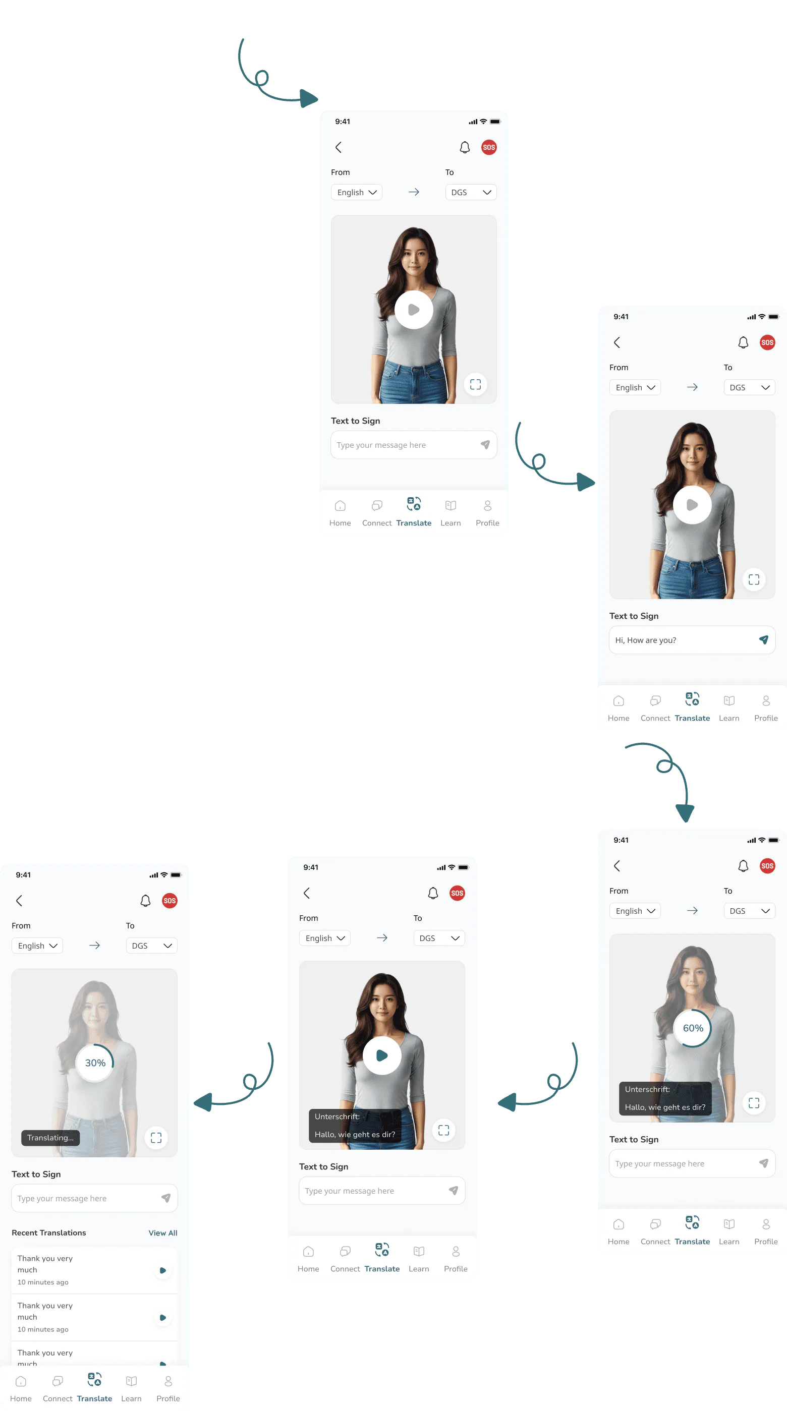
“Detecting…” instead of a spinner. The interface narrates what’s happening instead of asking users to trust a black box.
Camera blocked or hand out of frame → a named status and a retry CTA. The error state was wireframed before the success state.
A sub-400 ms render budget for text-to-sign, mapped from the Doherty Threshold. Model speed is a UX requirement.
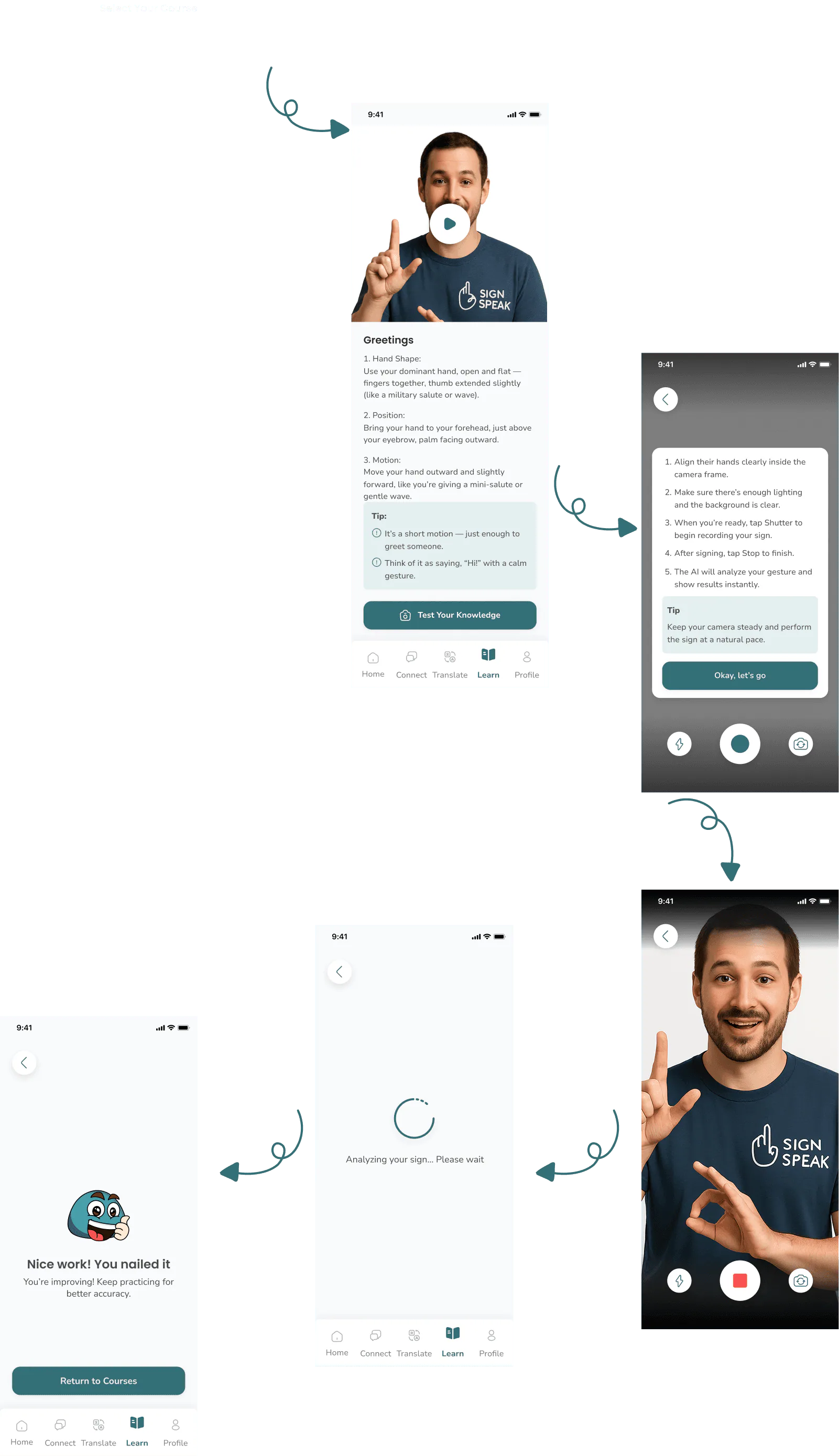
Open the camera, sign, read the caption — one-handed, with the confidence score visible. The caption is the answer, not another step.
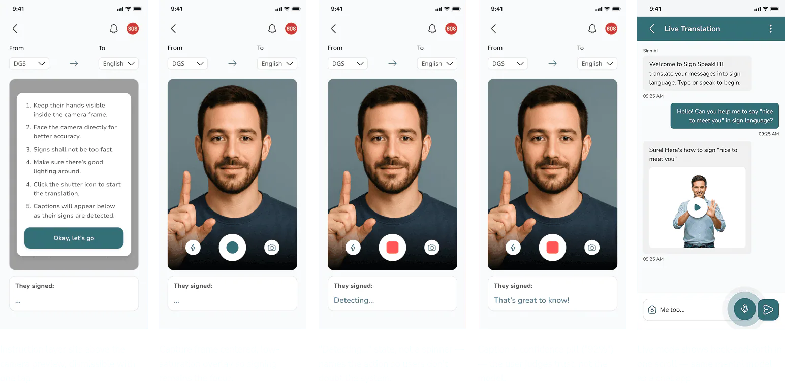
High confidence. Teal pill at 90%+; the caption renders directly.
Low confidence. Amber pill and a “Best guess:” prefix; re-sign or override.
Error state. Named status plus retry — never a silent failure.
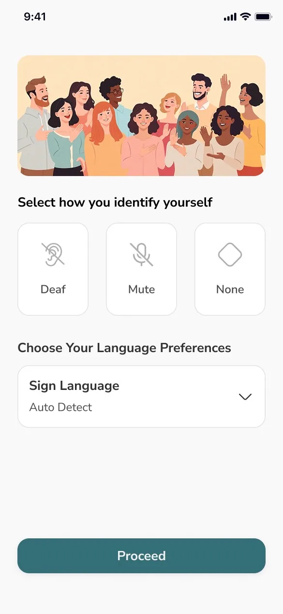
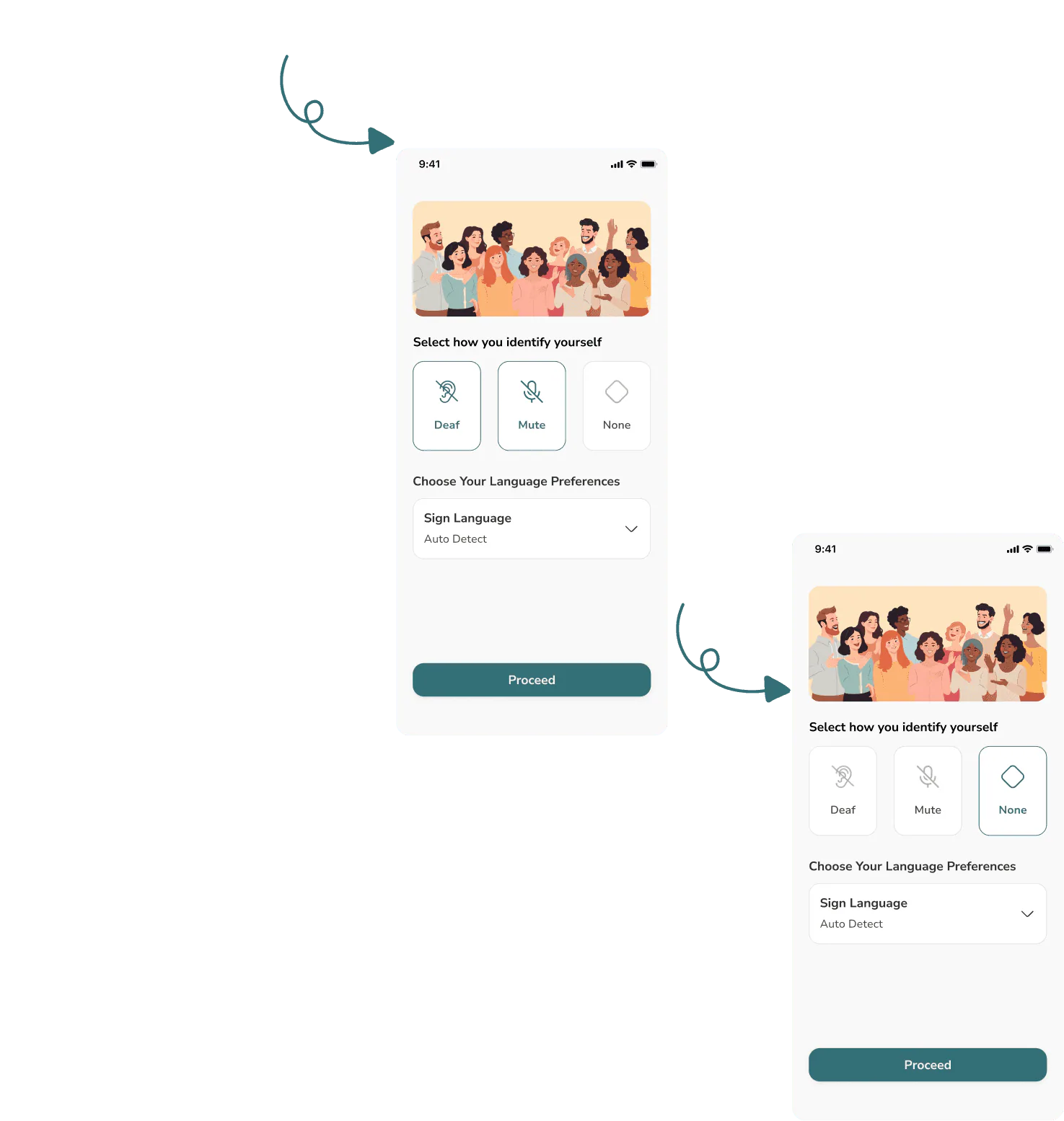
Designing for the moment speech is not an option.
A tap risks accidental triggering. One second forces intent without slowing a real emergency.
The SOS pill sits in the thumb arc — never blocked by the keyboard or system bar.
“I am Deaf — please face me when speaking” is written once. The live flow becomes confirm-and-send.
Coarse location attached for paramedic dispatch; easy to disable per contact.
WCAG AA on every state, and a long haptic pulse confirms the alert — feedback Deaf users can feel.
Like a sign language, a UI has rules. Defined once, reused everywhere — so the 91st screen costs the same as the 1st.
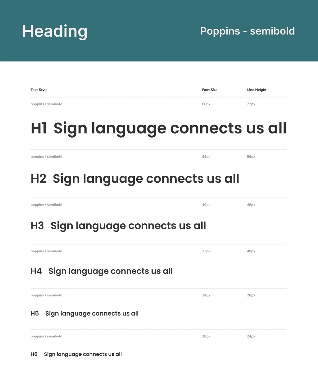
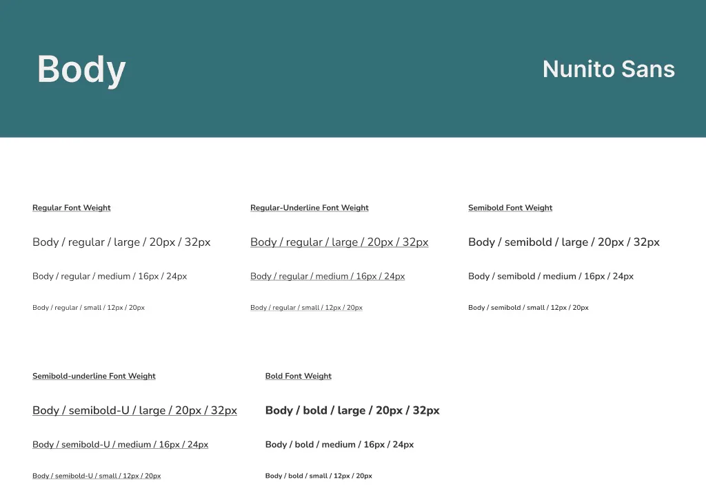
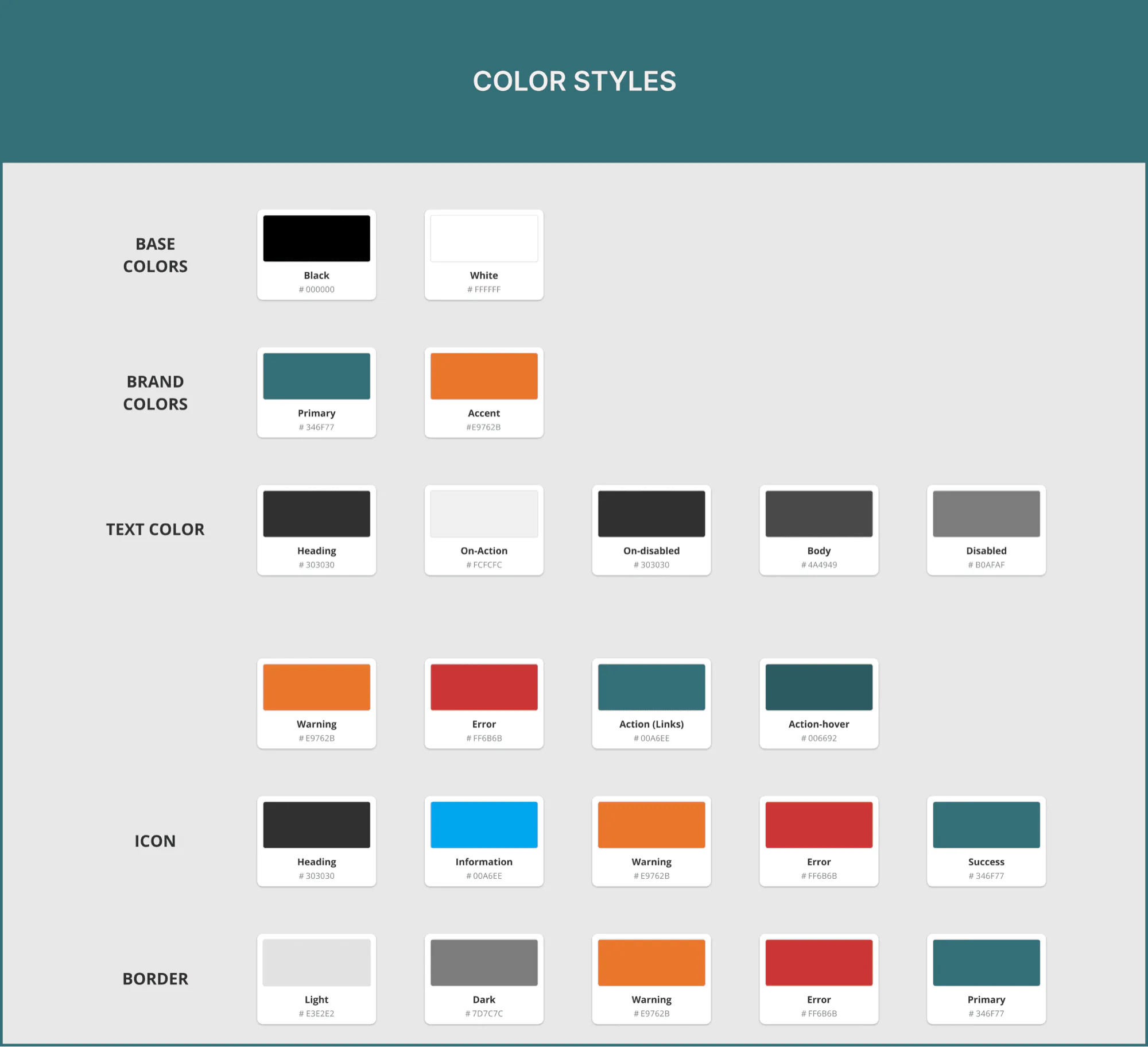
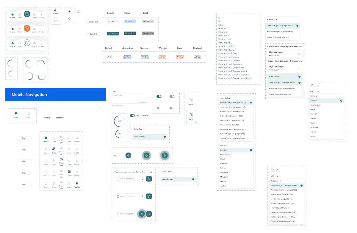
If it doesn’t carry meaning, it doesn’t ship.
DGS-first, ASL as opt-in.
Pre-written plus confirm, only.
Motion is checked like colour is.
Colour is always paired with shape, label or pattern.
An academic project — so no live usage numbers. Here’s what was built, and how it was judged.
Screens in a component-driven system
Tabs, one clear job each
Jobs in one app — translate, SOS, community
Final grade from a jury of three
Real-time DGS, emergency SOS and a community hub - in one app, where the market had none.
The component system kept 90+ screens consistent as a solo designer. Mapping UX laws to decisions made the work defensible to three professors. The 5-tab navigation mirrors familiar chat apps — zero relearn cost.
Master’s project · UCA × BSBI 2025 · prototyped end to end in Figma.