People finished tasks - then went back to check them twice.
Dense tables, no hierarchy, confirmations that came late or not at all. In port operations, “not sure if that saved” is a delayed shipment.
Making port operations feel safe to use.
An internal B2B platform for the Port of Singapore Authority. Two user roles, one shared spine — and a redesign built around one idea: people should trust what they just did.
Fewer operational errors
Team adoption within six months
Retention versus the previous workflow
Dense tables, no hierarchy, confirmations that came late or not at all. In port operations, “not sure if that saved” is a delayed shipment.
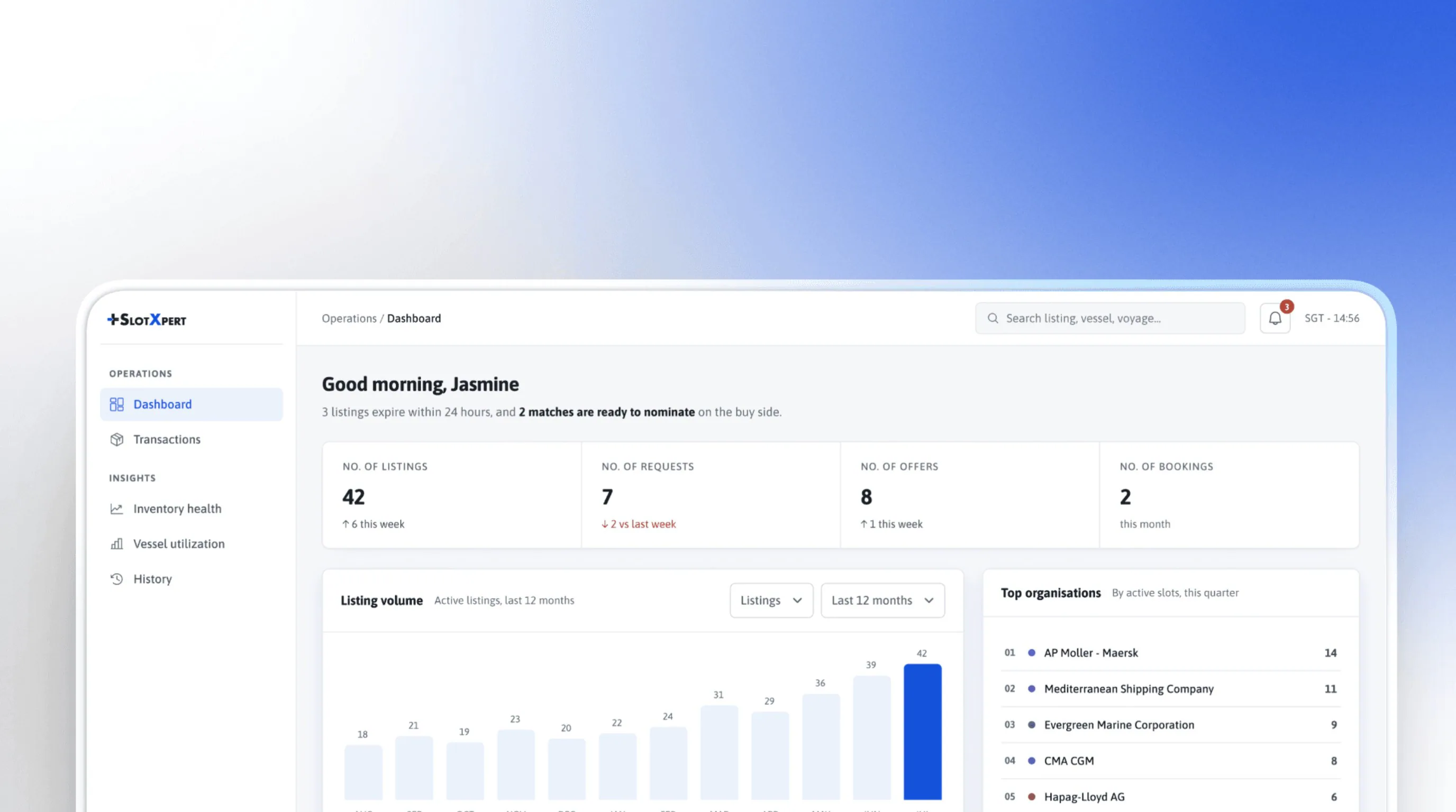
Role-based dashboards, one shared pattern language and confirmations you can’t miss — without retraining a single user.
Users stopped repeating actions out of uncertainty. Both numbers come from PSA’s own QA review.
Embedded in PSA’s cross-functional team through the Metafic design studio. I owned the process end to end — no hand-offs between designers, one line of thinking from data to shipped UI.
Mapped error-prone workflows from ~295 survey responses.
Role-specific IA with one shared pattern language.
Confirmation states, inline validation, progressive disclosure.
Components built around the backend and the shipping calendar.
Stayed close to engineering all the way through implementation.
SlotXpert is how PSA’s teams book and list container slots at one of the world’s busiest ports — huge volumes, every single day.
Any change had to feel like a better version of what users already knew.
Cognitive load was already the limiting factor before I added anything.
Adoption asked for familiarity, not novelty.
Delivery ran alongside operations — no quiet moment to roll out.
Designs had to route around the data structures, not through them.
PSA had surveyed both teams before I arrived. I took the raw data and turned a wall of freeform answers into something the team could act on.
Could users complete key actions without hesitation?
Where in the flow were errors clustering?
Did users trust the system had recorded what they just did?
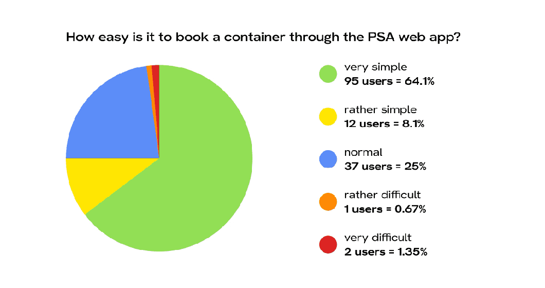
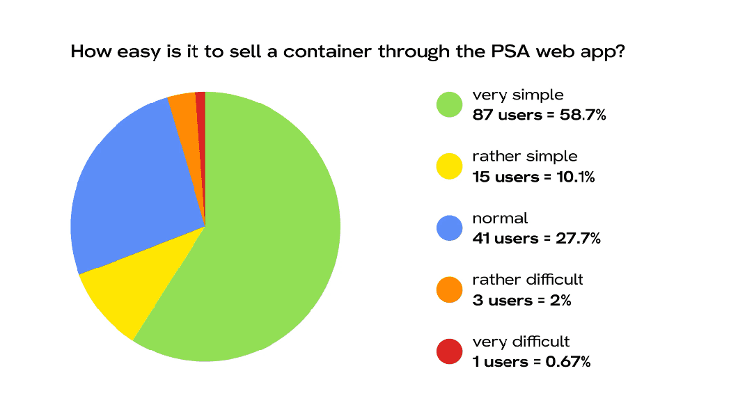
Source: PSA-provided survey summaries. I synthesised and visualised the findings; I did not administer the survey.
Completion wasn’t the problem. Confidence was.
Most users could technically finish their tasks — then went back to check them a second and third time. That framed the whole redesign: reduce errors, close the trust gap, don’t retrain anyone.
slowed down.
They compensated for uncertainty by re-checking everything — safe, but slow.
got things wrong.
They trusted a system that wasn’t telling them enough — quick, but error-prone.
The brief wasn’t visual. It was operational: make the system trustworthy enough that people act with confidence the first time.
Buyers and sellers run parallel workflows. They had to work side by side without drifting apart visually.
Buyers and sellers land in their own dashboards. The old shared dashboard mixed both roles — and quietly created most of the confusion.
Book slot. List container. Surfaced at the top of navigation — no hunting.
Learn one and you already know most of the other.
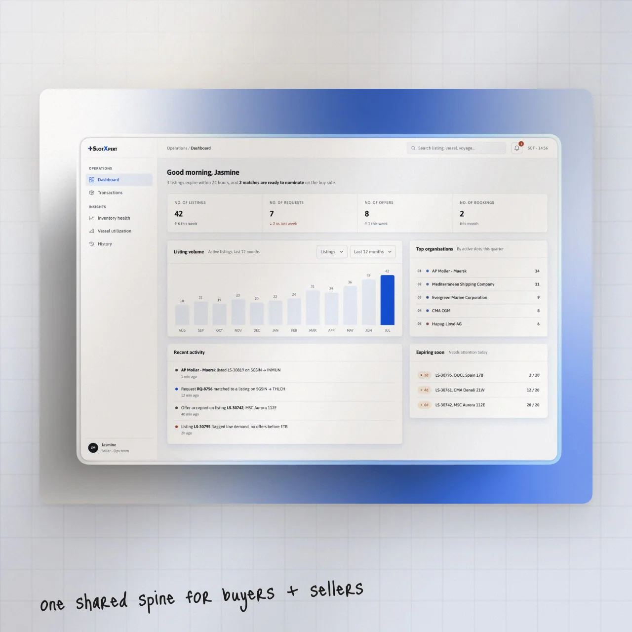
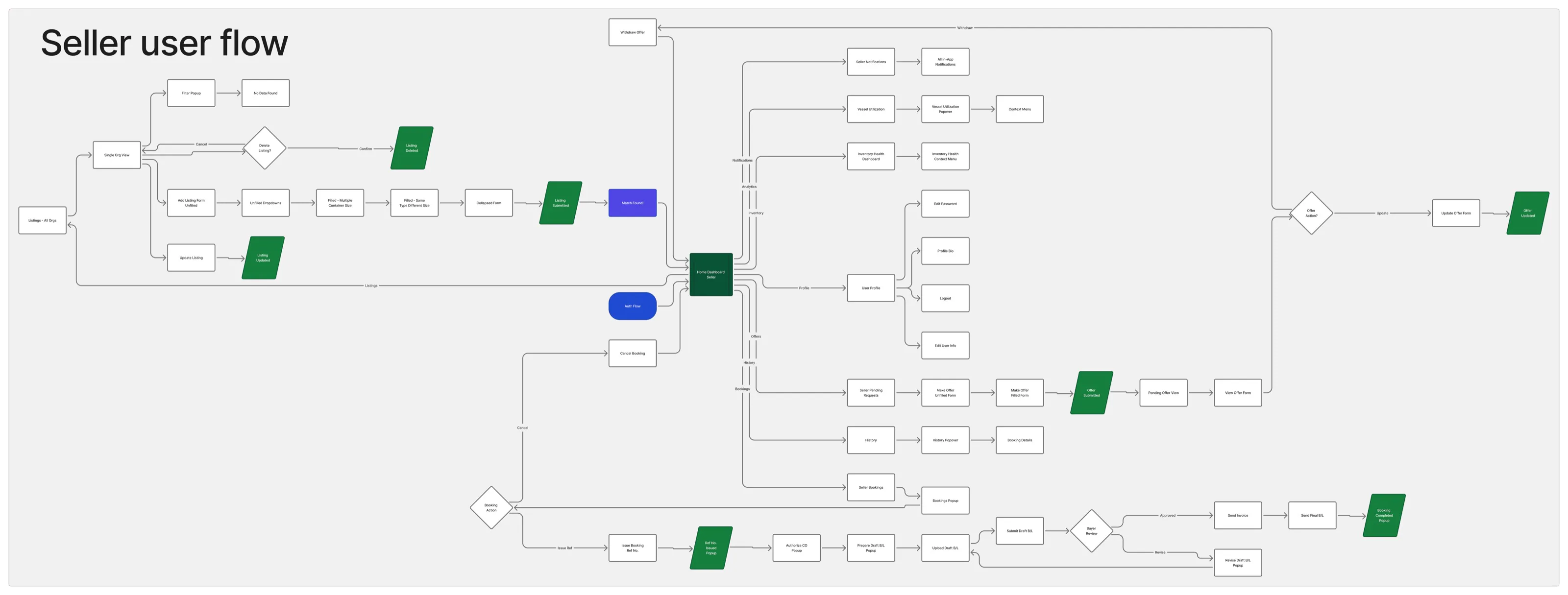
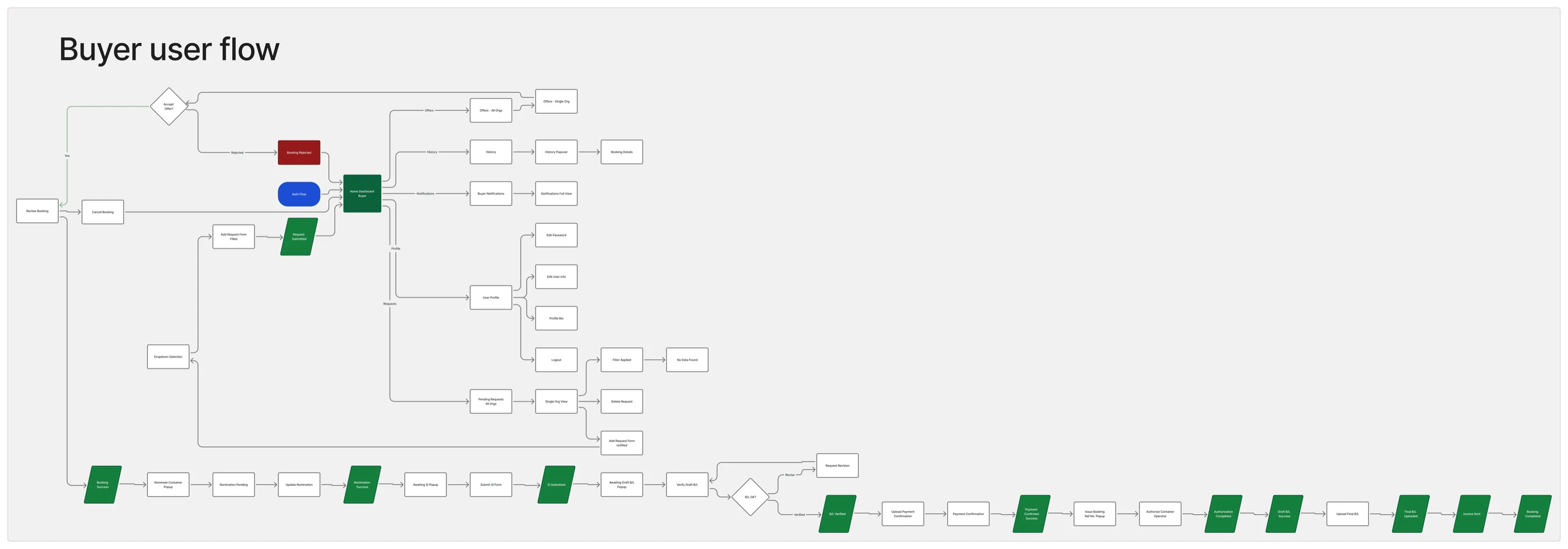
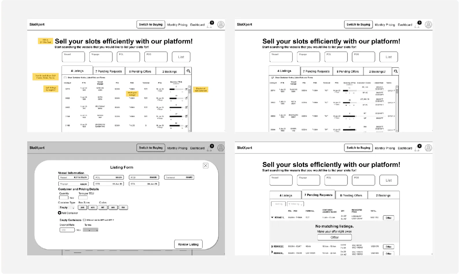
The client’s wireframes showed the existing mental model — a map, not a UI to copy. Wherever the friction data pointed to a broken interaction (slot booking for buyers, container listing for sellers), I rebuilt it.
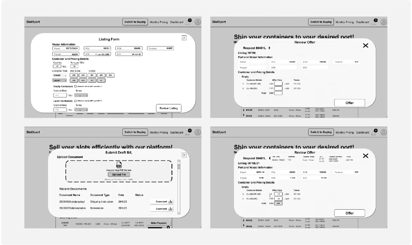
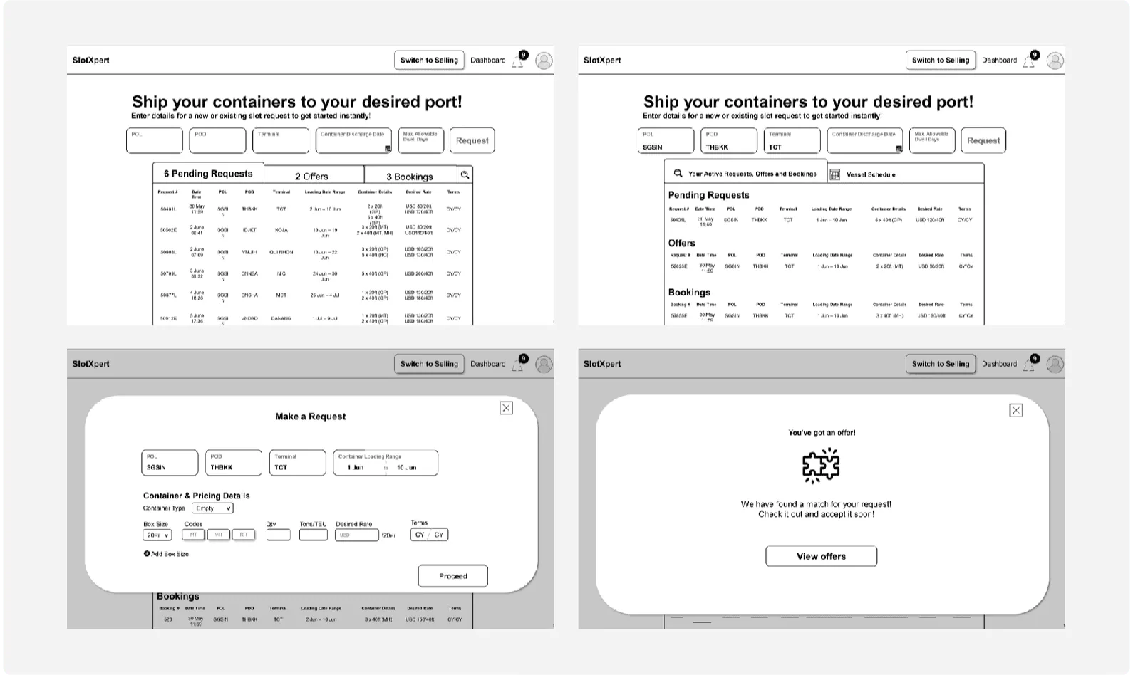
Four trade-offs I made on purpose — each one chose predictability over polish.
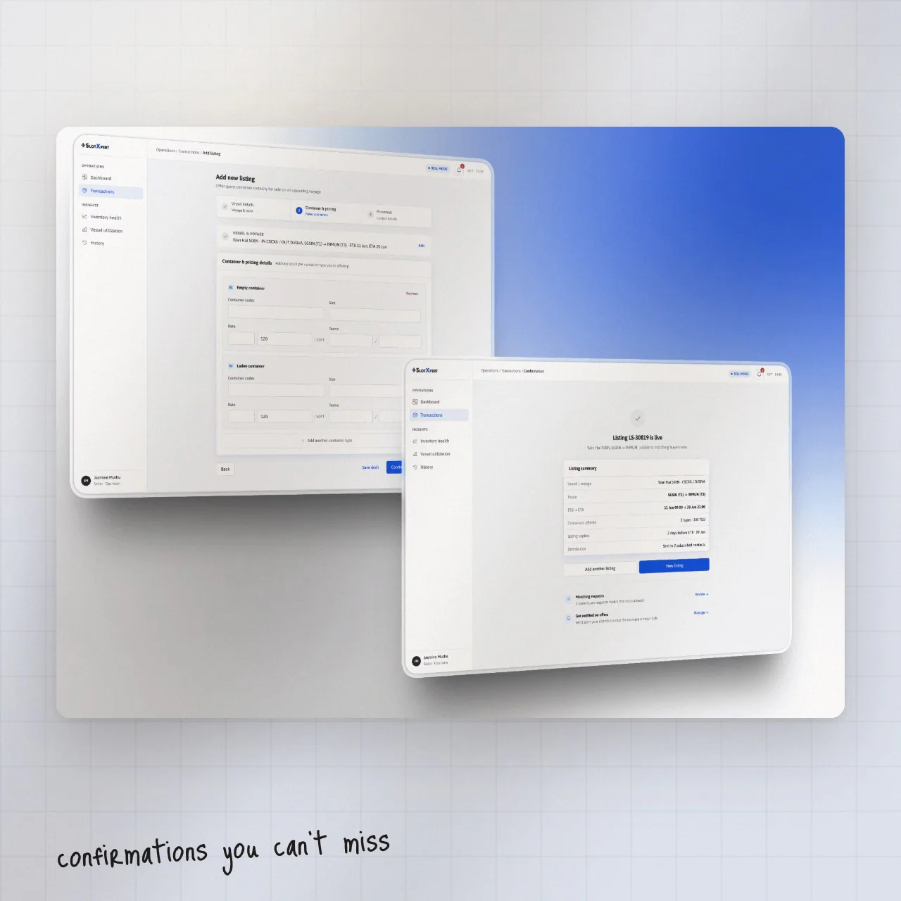
A cleaner design would have removed some confirmation feedback. I didn’t. The screens are busier than a consumer product — they’re also safer.
Hundreds of container records don’t need to be visible at once. Reveal them in context, where users are actually looking.
Retraining hundreds of trained users is slow and expensive, so core workflows stayed close to the existing mental model.
Some ideal solutions didn’t fit the data structures. I documented every compromise so future iterations can revisit them.
Status colour and organisation identity stay visually separate. If you see amber, it’s amber for a reason — never because it’s a client’s brand colour.
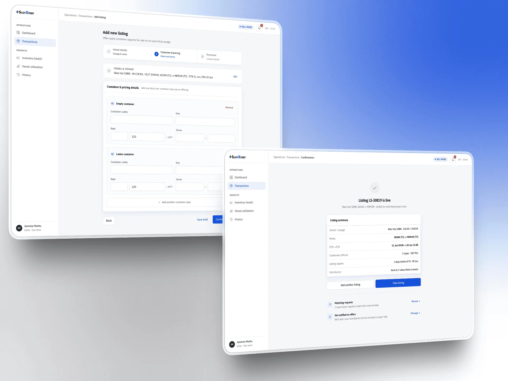
Primary action first. Book slot and list container sit at the top of navigation.
Explicit confirmation. Every commit ends in a state users can’t miss or misread.
Colour = status only. Organisation identity never borrows a status colour.
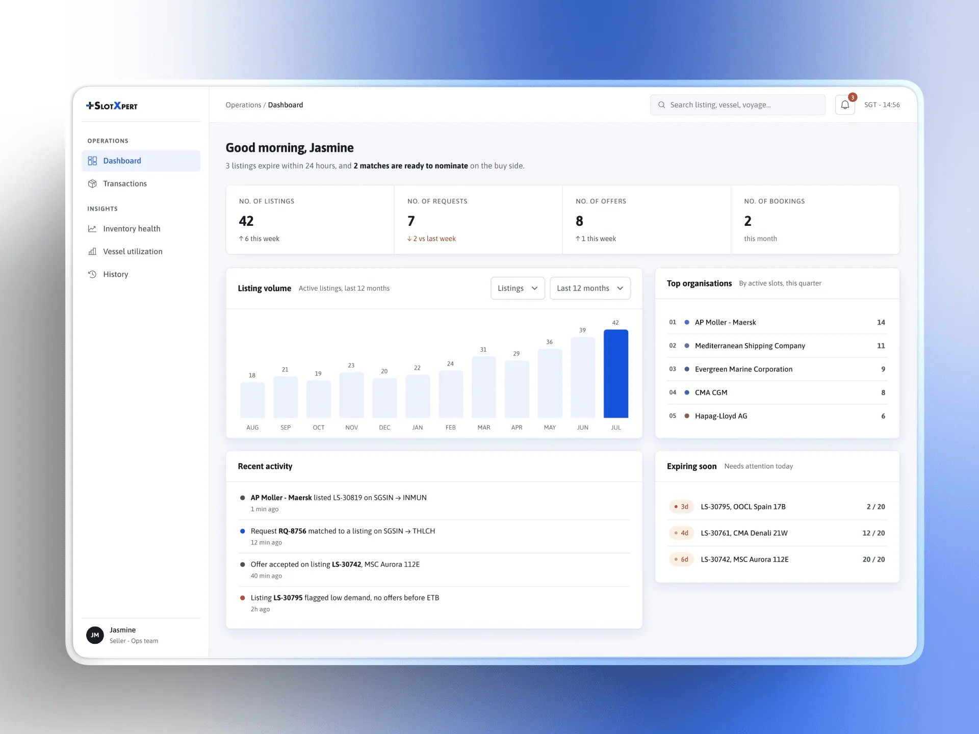
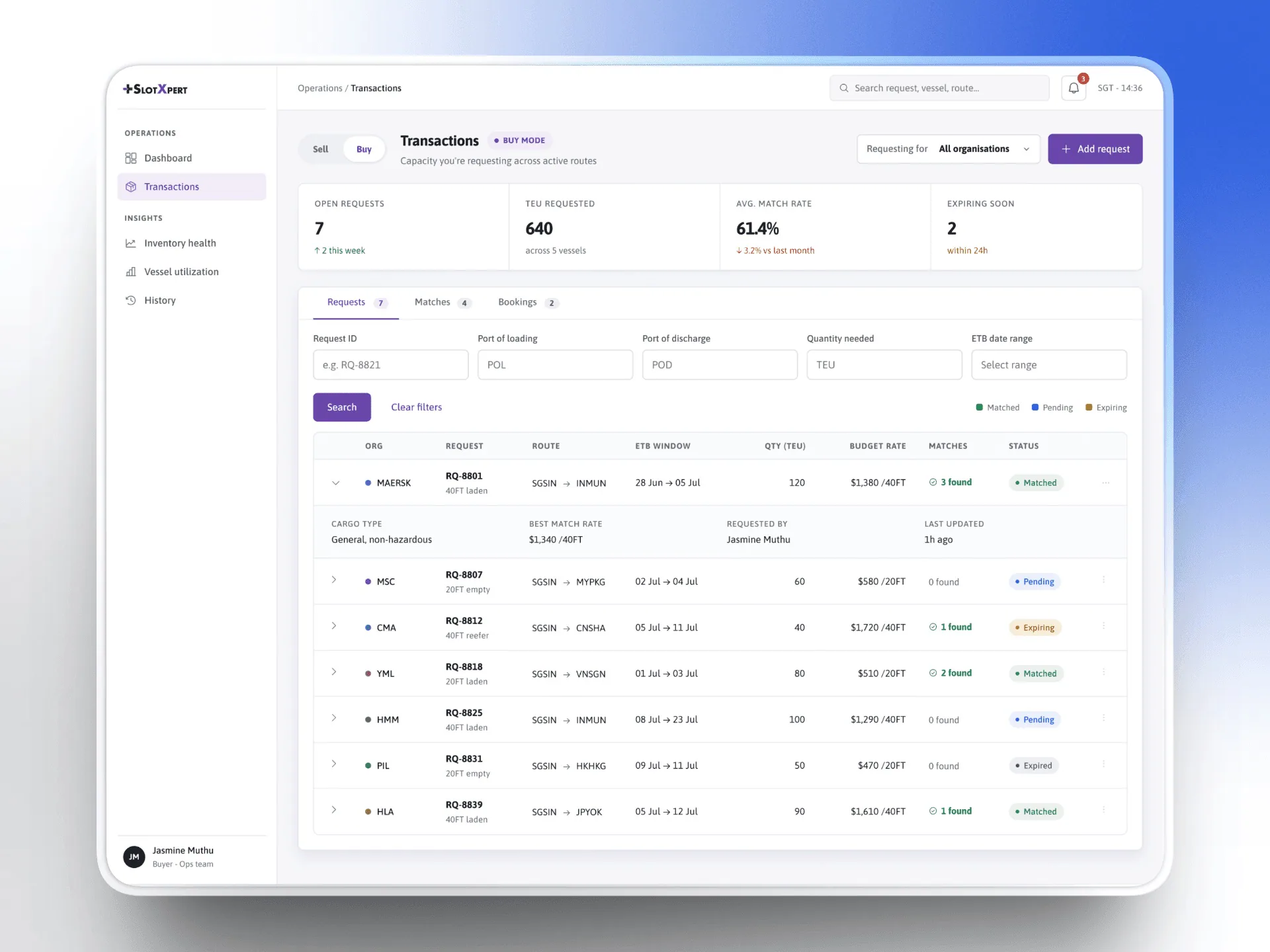
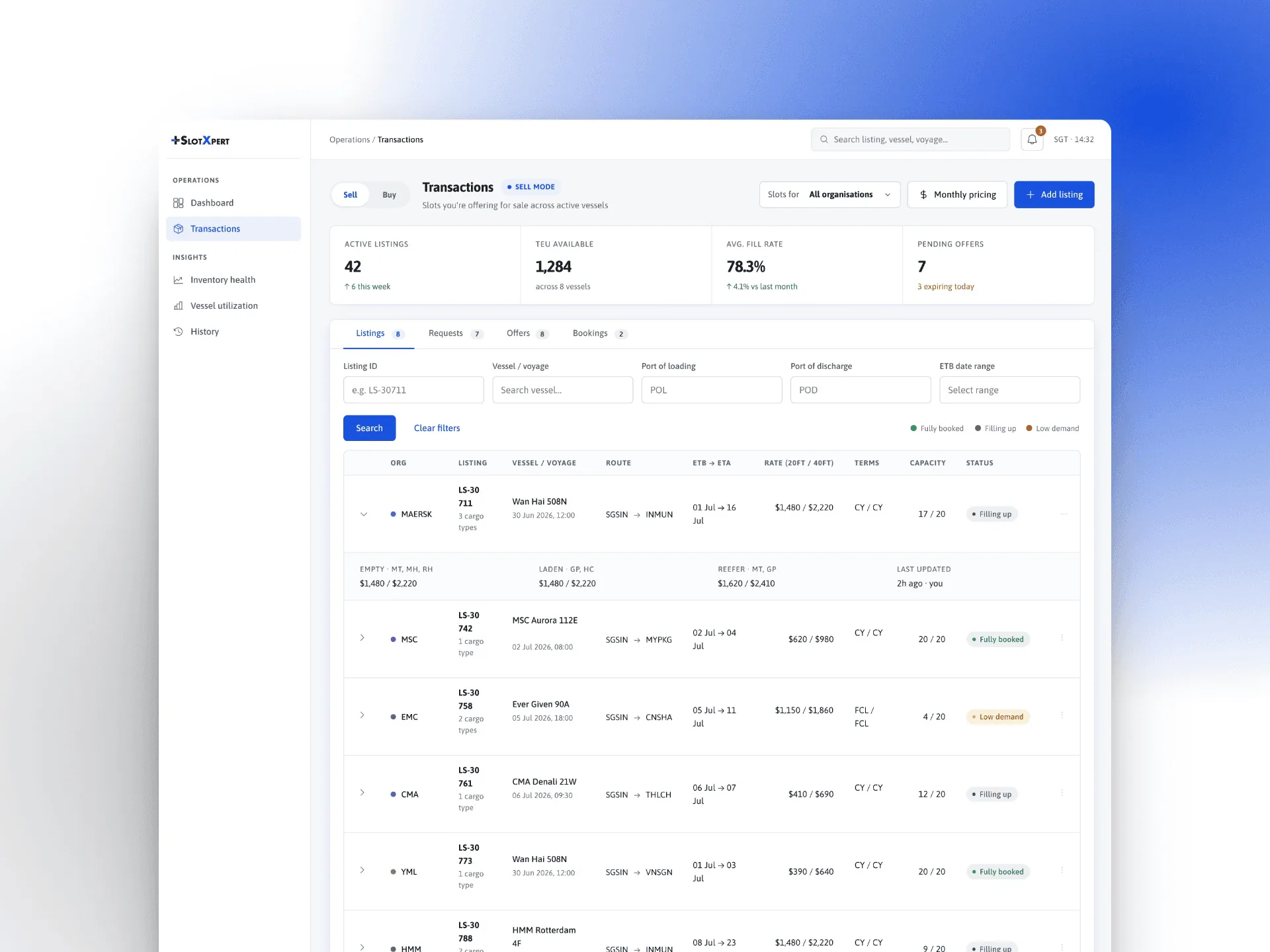
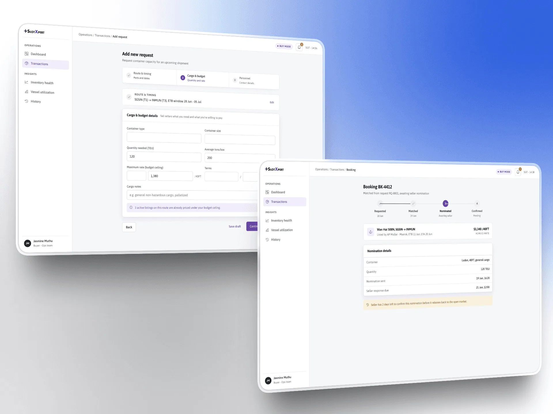
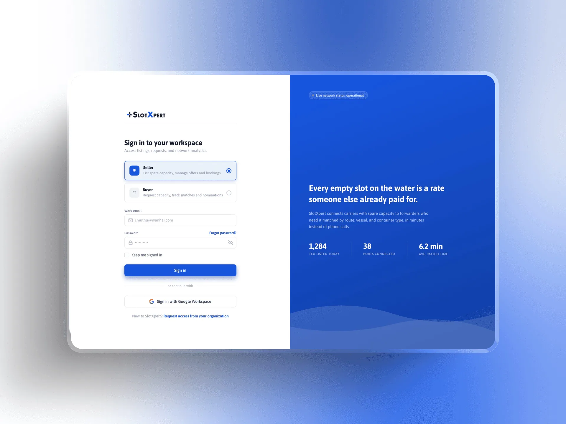
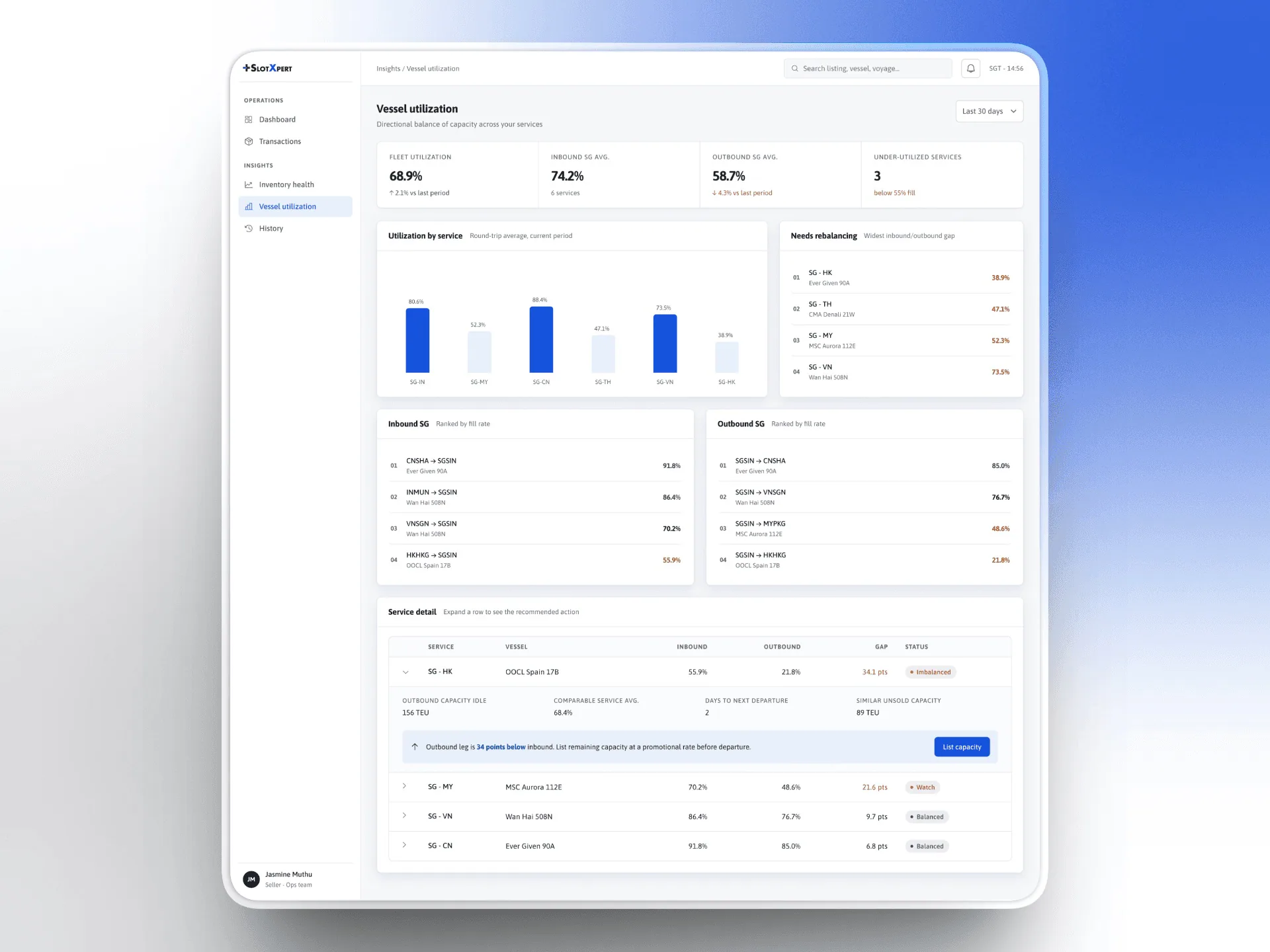
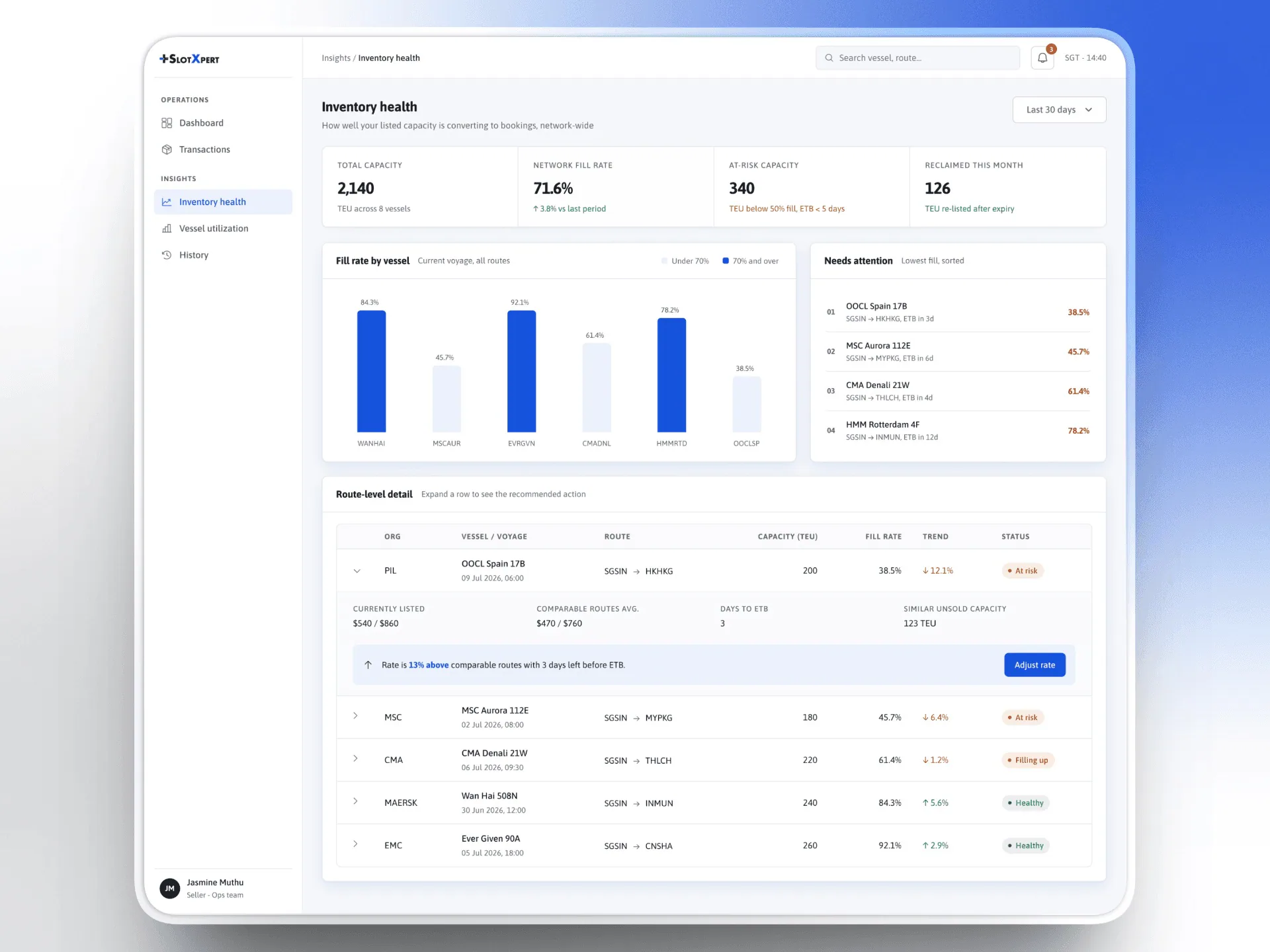
Data is anonymised and product-identifying details removed for NDA compliance.
From PSA’s six-month post-launch QA and stakeholder review.
Reduction in user errors
Adoption across buyer and seller teams
Retention versus the previous workflow
Time-on-task on both core flows
Users stopped repeating actions out of uncertainty.
The 35% didn’t come from one big idea. It came from the same error-prevention principles applied consistently across dozens of small interactions.
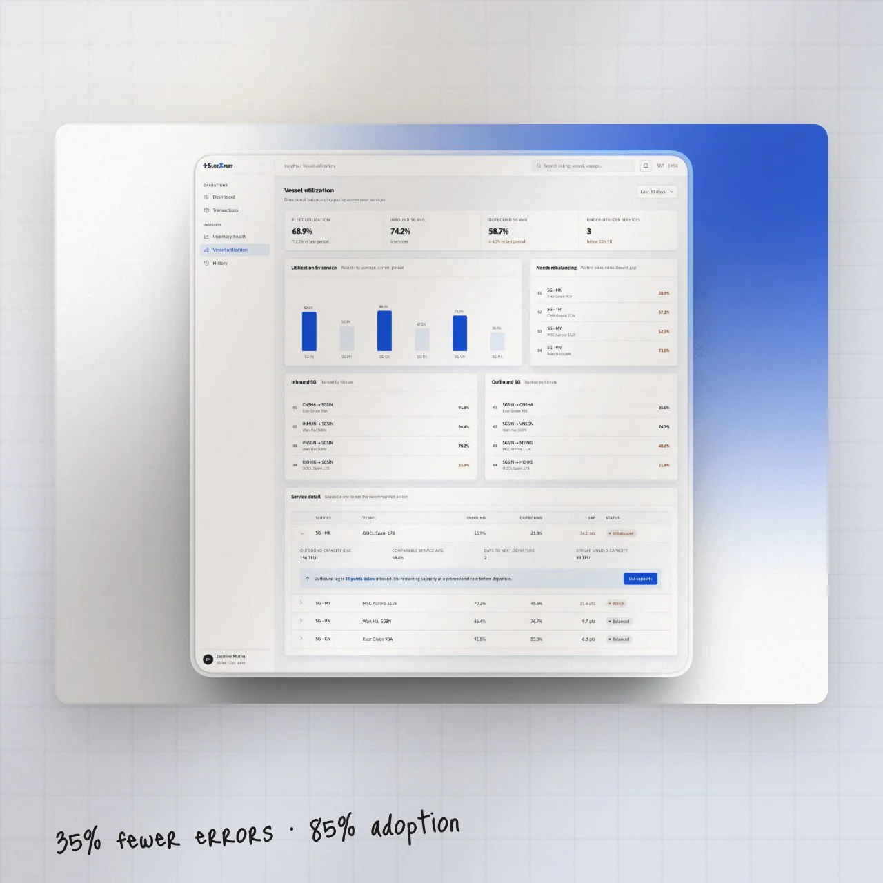
Metrics sourced from PSA’s internal QA and stakeholder review.
People who use a system every day for high-stakes work don’t need it to look clean. They need it to act predictably enough to trust their own actions.
Stakeholder review worked and the numbers say the direction was right — but moderated sessions with buyers and sellers before hi-fi would have de-risked interaction decisions earlier.
SlotXpert is internal to PSA. Screens use anonymised data with product-identifying details removed.